CSS toggle switches are a modern web design aspect that makes for user-friendly interfaces. Here's a complete guide to the types of beautiful CSS toggle switches you can use, including their design and functionalities:
1. Classic On/Off Toggle:

Features
- Change in text or color states.
- Accessible minimalistic design
- Use Case: This is the perfect use for enabling/disabling simple features.
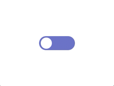
2. Round Slider Toggle:

A circular knob that moves side-by-side along a track
Features
- Smooth animations.
- Can include hover and focus effects.
- Application: Most common in mobile apps or new-age web applications.
3. Icon-based Toggle:
The toggle can use any two icons (for example, a sun and moon for dark mode).
Features:
- Textless aesthetics
- Customizable icons according to usage
- Use Case: Suitable for themes and content filtering.
4. Neumorphic Toggle:
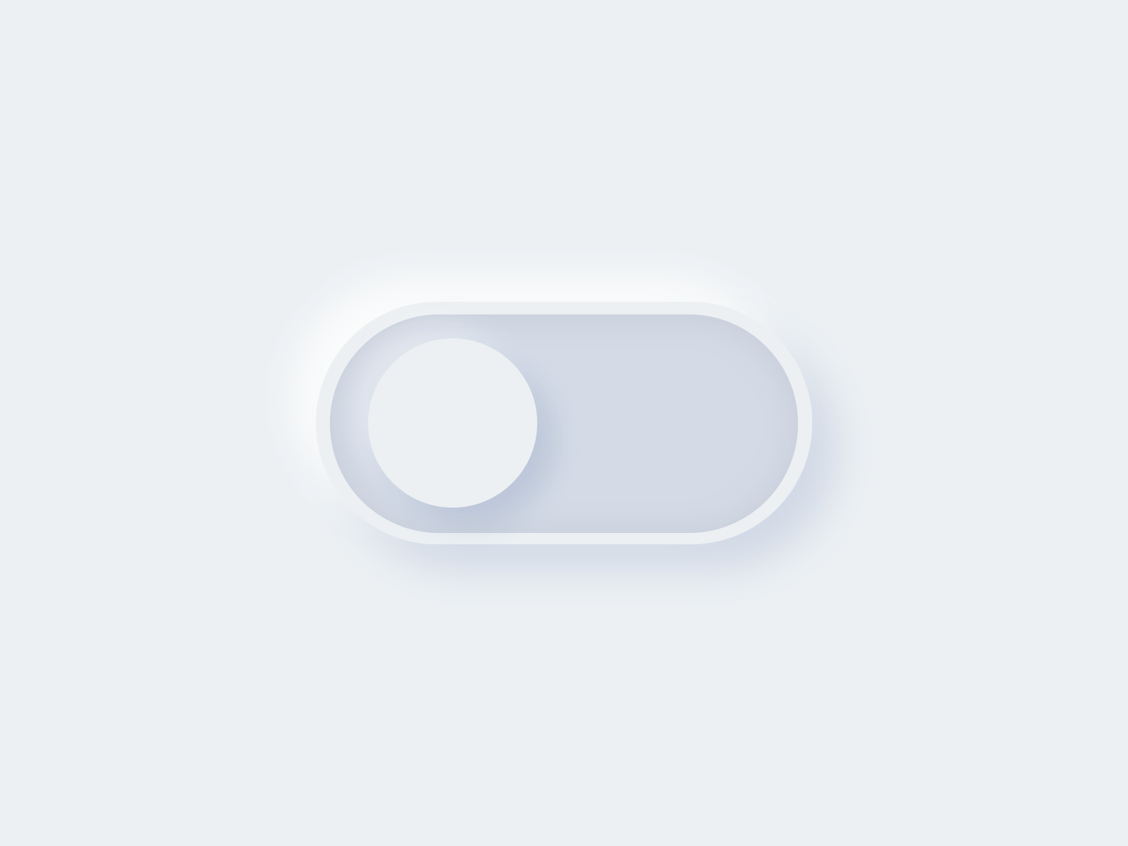
Uses neumorphic design, which means imitating soft, lifted shapes.
Features
- Subtle shadows and highlights help produce a 3D effect
- Complements neumorphic UI theming
- Use case: Trendy for use with modern dashboards.
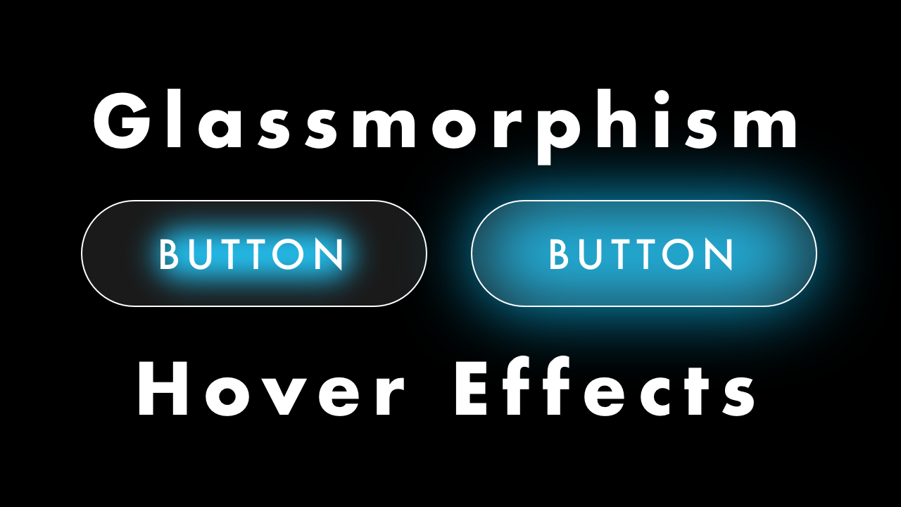
- Futuristic look
- Elegant look.
- Often combined with bright colors.
- Use Case: Suitable for apps or websites with a glassmorphism design.
6. Text/Label Switch:

Toggle switches where the knob is replaced by text, such as "Yes"/"No" or "1"/"0".
Features:
- Offers readability through clearly visible labels.
- Can be used with different fonts and styles.
- Use Case: Best suited when the state of the toggle needs to be clearly communicated.
7. Animated Toggle:

Adds whimsical animations while switching states.
Features
- Bounce, color gradients, or flipping
- Catchy transitions
- Use Case: Best for entertainment or gaming websites.
8. Material Design Toggle:
Based on Material Design guidelines of Google.
Features:
- Minimalist design with the ripples effects when clicked
- Color-coded (like green on and gray off).
- Use case: Perfect for those websites following the Material design guideline.
9. Gradient Toggle:

Adds gradients for a striking look.
Features:
- Gradient colors for the knob or track.
- Smooth gradient transitions on toggle.
- Use Case: Modern websites or designs with bright themes.
10. Split Toggle:

Splits the toggle into two sections with two different states, both clickable.
Features:
- Both states are clearly visible and interactive.
- Unique split design.
- Use Case: Helpful for cases such as "Buy" and "Sell".
11. Toggle with Tooltip:

Provides a tooltip indicating what the toggle is or represents.
Features:
- Improves user instructions.
- Tooltip can be hovered or focused on.
- Use Case: Useful for settings with many options
12. Custom Shapes Toggle:
Toggle with a shape that isn't a square, circle, triangle, etc., but instead might be stars, hearts, or other shapes.
Features:
- Extremely customizable and entertaining.
- It brings personality to the UI.
- Use Case: Very good for humorous or specialized websites.
13. Skeleton Loading Toggle:
Toggle with skeleton loading placeholders while pages are loading.
Features:
- States loading
- Increases user experience in slower networks.
- Use Case: Good for dynamic or data-driven applications.
14. Invisible or Transparent Toggle:
It is a minimalist toggle with almost invisible design that can be used as a background feature.
Features:
It focuses on subtlety.
It uses hover or active states for visibility.
Use Case: Minimalist websites or hidden options.


No comments:
Post a Comment