Thursday, 21 November 2024

Principle of Good Website Design.


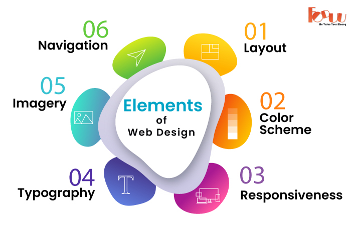
 Principle 1: User-Centred Design:

            A website should be designed with the user in mind, focusing on easy navigation,        accessibility, and providing a seamless experience.

 Principle 2: Simplicity:

Avoid unnecessary decorations and excessive elements that distract users. A simple, focused design helps users find what they need faster and improves overall experience.

 Principle 3: Visual Hierarchy:

   *  Important Elements First: Arrange elements (text, images, buttons) in a way that guides the user’s attention to the most important parts first.

   * Size and Contrast: Larger and more contrasting elements (e.g., buttons, headlines) naturally attract attention. Use this strategically to highlight key content.

   * Spacing and Alignment: Proper spacing between text, images, and other elements makes the content more readable and aesthetically pleasing.

"Need a New Website? We Can Help – Contact Us Now!"

Principle 4: Consistency:

    Design Consistency: Use the same colors, fonts, layout, and general style throughout the site for continuity.

    Behavioral Consistency: Interactive elements (buttons, links, forms) behave the same everywhere on the site so users know how to interact with them.

Principle 5: Responsiveness:

A responsive website changes its layout and content to fit different screens and devices, offering an optimal viewing experience to users irrespective of whether they are accessing the website from a desktop, a laptop, a tablet, or a smartphone.

Principle 6: Fast Loading Speed:

Fast page-loading time is a critical principle of good design and has a significant impact on user engagement, conversion rates, and search rankings.

This is supported by the fact that users deserted websites that took more than a few seconds to load, as with many lost opportunities and revenue. In order to get sites to load much faster, these must be minimized: image compression, code minification, browser caching, and server response times. "We Can Help You Build Your Website – Contact Us Now!

Principle 7: Clear Navigation:

    Clear navigation is part of the important elements of good website design that guarantees easy finding of information requirements and smooth movement through a site.
     dropdown or mega menus is helpful when there is a lot of hierarchical content but doesn't clutter up the main navigation.

Principle 8: Engaging content:

       Content is one very crucial principle of good web design in keeping users interested, informed, and motivated to dig deeper into the site.
       Effective use of typography, be it in choosing correct text font size and space, can greatly improve readability and make the content more inviting to users. 
       Breaking up of the text into smaller, easily digestible chunks; using headings, subheadings, bullet points, and images to make it quick to scan and understand will help.

Principle 9: Call-to-Actions (CTAs):

A Call-to-Action (CTA) is a prompt on a website that encourages users to take a specific action. It's typically a button, link, or message that invites users to do something, such as buy a product, sign up for a newsletter, download an app, or contact support.

For example:

  • "Buy Now" on an online store page
  • "Subscribe" on a blog page
  • "Learn More" on a product page

Principle 10: Mobile-First Design:

  • Prioritize Mobile: Designing for mobile devices first ensures that the website is optimized for smaller screens and then adapts well to larger screens.
  • Touchscreen Friendly: Consider touch interactions when designing buttons and navigation menus, ensuring they are large enough and well-spaced.

  • Wednesday, 20 November 2024

    "How to Choose the Right Color Scheme for Your Website"


    1. Understand the Psychology of Colors:

    Colors evoke specific emotions and reactions, and different hues can communicate different messages to your audience. Here are some common color associations:

    Blue: Trust, professionalism, calmness. Often used by corporate brands, banks, and technology companies.

    Red: Energy, urgency, excitement. Common in sales, promotions, or entertainment sites.

    Green: Growth, health, nature. Often used for eco-friendly brands, health sites, or financial institutions.

    Yellow: Optimism, attention-grabbing, happiness. Best for calls to action or youthful brands.

    Black: Luxury, sophistication, elegance. Most used by high-end products or fashion brands.

    Orange: Creativity, enthusiasm, fun. Good for entertainment or tech startups.

    Purple: Royalty, creativity, mystery. Mostly used by beauty or luxury brands.

    White: Cleanliness, simplicity, purity. Ideal for minimalist designs or creating space.

    "Need a New Website? We Can Help – Contact Us Now!"

    2. Reflect Your Brand's Identity:

    the color scheme of your website should mirror your brand personality.

    A bright orange or green, on the other hand, can represent a fun tech startup.


    3. Limit Your Palette to 3-4 Colors:

    The common mistake is having too many colors, which can easily make things messy and chaotic. Instead, limit your palette to three to four main colors:

    Primary Color This represents your brand.
    Secondary Color This color is often set for secondary application or highlights.
    Neutral Color These are shades of gray, black, or white that go to backgrounds, text, or spacing.
    Optional Accent Color A contrasting color set in call-to-action buttons or key elements.
    This balanced approach helps to create a clean look with cohesion without overwhelming the visitor.

    4. Test Color Combinations:
    Before finalizing the color scheme, create mockups of your website and test the color combinations. Ask various users, and pay attention to how well your chosen colors work together. It's essential that your colors both look right and work well across a variety of devices and lighting conditions.

    5. Keep Your Industry in Mind:
    Some industries have well-established color norms, so consider these when selecting a color palette:

    Healthcare: Blue, green, and white are commonly used as they convey trust, calm, and cleanliness.
    E-commerce: Bold, vibrant colors like red and orange are used to grab attention and drive action.
    Technology: Blue, black, and gray are among those colors that are often given the meaning of professionalism and innovation.
    It remains within the industry norms so your website could suit the expectations of your audience yet provides a unique visual experience.

    6. Utilize Tools and Resources:
    There are many online tools available, which assist you in choosing just the color scheme that you want for your website:

    Colors: This tool allows you to create a color palette based on your personal preferences.
    Canva's Color Palette Generator: Good for experimenting with color combinations and creating your own palette.
    Adobe Color Wheel: Uses the color wheel to generate color harmonies and palettes.
    Paletton: A tool that could be helpful in designing color schemes using complementary, analogous, and triadic color principles. The tools above can all work together to create colors that harmonize and communicate your brand's identity.

    7. Don't Forget Mobile Design:
     percentage of your web traffic will be coming from mobile devices, make sure your color scheme is legible on smaller screens. 
    Vibrant colors often work extremely well on mobile, but avoid those that might clash when viewed on a range of devices.

    Tuesday, 19 November 2024

    The Most Powerful Website Design Tools

     1. Website Design Software (Visual Design Tools):

          These tools are focused on visual design and layout creation, mainly with drag-and-drop functionality. These tools are therefore user-friendly for beginners and for professionals alike.

    Figma

    Type: UI/UX Design Tool, Web Prototyping

    Key Features:

         * Cloud-based, real-time collaboration.
         * Design, prototype, and gather feedback all in one tool.
         * Vector-based design.
         * Auto-layout for responsive designs.
         * Extensive plugin ecosystem.   

    Best for: UI/UX design, prototyping, wireframing, collaboration.

    Pricing: Free for individual use; paid plans for teams and advanced features.

    Adobe XD

    Type: UI/UX Design Tool, Prototyping, Wireframing

    Key Features:
         * Vector-based design tools.
         * Interactive prototyping and wireframing.
         * Syncs with Adobe Creative Cloud.
         * Includes live previews for mobile and desktop.
         * Auto-animation and advanced transitions.
    Best For:  Prototyping, wireframing, high-fidelity UI design.

    Pricing:  Free plan available; paid plans with more features.

    Sketch

    Type: UI/UX Design Tool, Wireframing

    Key Features:
         * Vector-based, so highly responsive to the tiniest control.
         * Extensive library of plugins and integrations.
         * Symbols for reusable components.
         * Advanced prototyping and user flows.
         * Native macOS application.

    Best For: UI/UX design, wireframing, mobile apps.

    Pricing: Subscription-based, free trial available.

    Canva

    Type: Graphic Design, Web Design for Non-Designers

    Key Features:
          * Drag-and-drop interface with templates.
          * Web templates for creating landing pages, social media graphics, etc.
          * Limited website-building features (e.g., simple one-page websites).
          * Collaboration features for teams.

    Best For: Beginners, quick designs, marketing materials, and graphics.

    Pricing: Free version available; Pro version with more features.


    ADAPTIVE Vs. RESPONSIVE WEBSITES: WHICH IS BETTER?


     Responsive Website vs. Adaptive Website:

         designing websites to be viewed on different devices and in a range of screen sizes, there are two trends-Responsive web design (RWD) and adaptive web design (AWD). Both methods are aimed at better user experience on the platforms, although they deploy different strategies to achieve this. Let's take apart the main differences between the two.

    1. Responsive Web Design (RWD):

    A responsive web design is an approach to the design of websites such that it adjusts automatically according to the size and display resolution of a given display device being used. This approach makes use of fluid grids, flexible images, and media queries to create a seamless experience across different devices-from desktop monitors, tablet screens, and smartphone screens.

    Key Features :

         Fluid layouts: All content and layout elements are measured in percents rather than fixed pixels, so the design can "fluidly" adjust to a multitude of screen widths.

        Media Queries: CSS techniques which enable the website to apply different styles based on the characteristics of a device; screen width, height, and resolution, for instance.

        Single codebase: One set of HTML, CSS and JavaScript files for all devices, making it easier to maintain and update.

        Fluid Images and Videos: Images and other media resize automatically depending on the screen size.

    How It Works:

    The same content is delivered to all devices, but the layout and styles change dependent on screen size. For example, what may be a 3-column layout on a computer might become a single column layout on a phone.

    "We Can Help You Build Your Website – Contact Us Now!"

    2. Adaptive Web Design (AWD):

    Adaptive web design is the approach in which the website detects the screen size of the device and provides a different version of the site optimized for this specific device. Unlike responsive design, adaptive design will use one of the multiple fixed layouts for various screen sizes.

    Key Features:

    Multiple Layouts: The website can differentiate between the screen size and serve pre-designed layouts that fit accordingly to the type of device. For instance, a site may have a mobile and tablet and desktop layout.

    Device-Specific Content: Often, Adaptive design delivers device-specific content or features, such as showing a more simplified version of a website to mobile users.

    More Control Over the Design: A designer will have more control over how the website is displayed on specific devices, making it easier to create a tailored experience.

    How It Works:

    The server detects the screen size of the device and loads the particular version of the site, which has been optimized for it. A desktop user may see a more feature-rich and complex version of the site, whereas mobile will get a simple layout with fewer elements.


    Key Differences:

    FeatureResponsive Web DesignAdaptive Web Design

    Layout

    Fluid layout adjusts to screen size.

    Multiple fixed layouts based on device type.

    Codebase


    Single codebase for all devices.         

    Multiple codebases for different devices.
    Implementation
    Uses CSS media queries to adjust design.
    Detects device and serves a tailored layout.
    Performance
    May load unnecessary resources on smaller devices.

    Can serve optimized content for each device, improving performance.
    Maintenance
    Easier, as only one design needs updates.

    More complex, as each device-specific layout must be maintained.

    User Experience

    Consistent, fluid experience across devices.
    Customized experience based on device.
    SEO
    Single URL for all devices, easier to manage.

    Multiple URLs for different layouts, which can affect SEO.


    "The Ultimate Showdown: Which E-Commerce Website Type Reigns Supreme?"


     E-Commerce Websites:

         An e-commerce website is an online place where commercial entities and customers can buy or sell products or services. Such websites facilitate online transactions by hosting a digital storefront in which products are displayed, and actual payment options are integrated for secure purchases.

    Types of E-Commerce Websites:

    1. Business-to-Consumer (B2C) E-Commerce Websites:

         This is the most common type of e-commerce website. B2C websites allow direct sales from companies to individual consumers.

     Example: Amazon, Walmart, Zappos, Target, Best Buy.

    Features:

        * Offer a product catalog with descriptions and images.

        * Allow customers to have a shopping cart and check out.

        * Integration of a payment gateway (credit/debit card, digital wallets).

        * Customer reviews and ratings.

        * Order tracking.

    Use Case:

           Retail products such as clothing, electronics, groceries, etc., are sold to consumers. Customers can browse, compare, and purchase items online.

    2. Business-to-Business (B2B) E-Commerce Websites:

        B2B websites enable businesses to sell their products or services to other businesses. The vast majority of the time, these are transactions that include bulk orders or wholesale pricing.

    Examples: Alibaba, Thomas Net, Grainger, Made-in-China.com.

    Features:

       * Bulk pricing and volume discounts.

       * Business account registration and login functionality

       * Support for invoicing and quotation generation.

       *  Order history and reordering options available.

       * Interface integration with enterprise systems (such as ERP, inventory management).

    Use Case:

    Wholesale suppliers or manufacturers of raw materials, machinery, or finished goods to other businesses (e.g., a factory purchasing components).

    3. Consumer-to-Consumer (C2C) E-Commerce Websites:

    C2C e-commerce websites allow consumers to sell directly to other consumers. These websites usually serve as third-party marketplaces through which people can buy and sell goods or services.

    Example: eBay, Craigslist, Etsy, Poshmark, Depop.

    Functions:

        * User profiles and product listings.

        * Auction or fixed-price sales.

        * Payment processing (usually third-party systems, such as PayPal).

        * Seller ratings and feedback systems.

        * Messaging systems to facilitate buyer-seller communication.

    Use Case:

    People are selling used goods, handmade products, or collectibles to other consumers.

    4. Consumer-to-Business (C2B) E-Commerce Websites:

    C2B websites allow people to sell goods or services to businesses. This model is often adopted by freelancers or service providers; sometimes it is also adopted by consumers when they're selling their data, photos, or content.

    Example: Upwork, Freelancer, Shutterstock, 99designs.

    Features:

         * Job posting or product listing where businesses seek consumer services or goods

         * Payment systems for freelance work, sales of content or services.

         * Contract management and project tools.

         * Reviews and ratings for freelancers or service providers.

    Use Case:

       Freelancers offering their skills to companies, such as web developers, graphic designers, or photographers.

    5. Business-to-Government (B2G) E-Commerce Websites:

         B2G websites enable enterprises to offer their wares or services to a governmental agency. It mainly used for purchases or public sector contracts.

    Example: FedBid, GSA Advantage (U.S. Government Services Administration), GovWin.

    Features:

          * Government-specific procurement and tendering systems.

          * Secure portals for bidding and submitting proposals.

          * Regulatory compliance with government contracts.

          * Electronic invoicing and contract management.

    Use Case:

    Office supplies or construction services offered to a government department by a business.

    6. Subscription E-Commerce Websites:

    These websites sell products or services on a recurring subscription model, where customers receive regular deliveries or access to a service.

    Example:  Netflix, Spotify, Dollar Shave Club, Birchbox.

    Features:

         * Subscription management system (e.g., monthly or annual billing).

         * Customization options (e.g., product selection based on user preferences).

         * Automatic recurring payments.

         * Delivery management for physical products (e.g., monthly subscription boxes).

         * Content access or streaming features for digital services.

    Use Case:

        Customers subscribe to products (e.g., beauty care, snacks, or razor blades) or digital content (e.g., video, audio, or software).


     "Let’s Create Your Perfect Website – Contact Us Now!"


    Monday, 18 November 2024

    "Is Your Website Ready for the Future? Static vs. Dynamic—Find Out Now!"


    Static Website:

    A static website is one that has non-changing content; that is, the information on every page is the same for every visitor. These pages are usually made using HTML, CSS, and sometimes JavaScript.

    Key Characteristics:

    Fixed Content: The content of each webpage does not change unless the file itself is hand-updated by the owner of the website.
    No Server-Side Processing: Static websites are served straight from the server as is. There is no interaction with a database or server-side scripting.
    Speed: Static sites because they are pre-built don't have server-side processing and hence tends to load faster.
    Simple to Build: It's simple to build, using basic HTML and CSS, without the need of complex backend technologies.
    Low Interaction: Static websites typically do not support advanced features such as user logins, form submissions, or content customization.

    Use:
             Personal portfolios
             Business landing pages
             Blogs (simple ones without interactive features)
             Small informational websites

                                                   "We Can Help You Build Your Website – Contact Us Now!
    Dynamic Website:

    A dynamic website is one that generates content at runtime based upon user input or any other form of input. These websites interact with databases and/or use server-side scripts such as PHP, Python, or Node.js, among others, to generate content at runtime.

    Key Characteristics:

    Dynamic Content: The content is determined by some variable user behavior, the session data, or a database.
    Example: A visitor might get different content every time that person visits based on their location, preferences, or history of interaction.
    Server-Side Processing: Most dynamic sites use server-side programming-like PHP, Python, or Ruby-serve the data retrieved from a database, which then generates the HTML content sent to a user's browser.
    More complex features: Account management, comments, search functionality, or e-commerce features are all optional with dynamic sites.
    CMS: WordPress, Joomla, or Drupal-the most typical systems for building dynamic sites, allowing for content management by non-technical people.

    Use :
            E-commerce sites (e.g., Amazon, eBay)
            Social media platforms (e.g., Facebook, Twitter)
            Content-heavy websites (e.g., news outlets, blogs with comments)
            Online services (e.g., banking apps, email clients)

    Summary Comparison:

    FeatureStatic WebsiteDynamic Website

    Content

    Fixed and unchanging

    Dynamic, can change based on user input/data

    Complexity

    Simple, easy to build and maintain


    More complex, requires backend programming and database

    Speed

    Faster loading times

    Slower loading times (due to server-side processing)

    Interactivity


    Limited (basic interactions via JavaScript)

    High (e.g., user accounts, forms, search)

    Cost

    Cheaper to host and maintain

    More expensive to host and maintain

    Security


    Generally more secure (fewer attack vectors)


    Can have security vulnerabilities if not properly configured
    Examples


    Business homepage, portfolio site
    E-commerce sites, social networks, blogs with user-generated content.


    Key Element of Web Design


    Layout and Structure:                                                                                                             

      Layout refers to how content would be arranged and presented on a page. It's the process of arranging various aspects such as text, images, buttons, and navigation menus in a way that brings in a logical flow and gives the site the appearance of being both aesthetically pleasing and easy to use. A grid system is often used in design, particularly for structuring content across columns and rows, in order to attain harmony in the design.  

    Color scheme:

             Color plays a significant role in establishing the tone, brand identity, and aesthetic appeal of the website. Color palettes can enhance the visual appeal, readability, and user experience for any site. 

    Responsiveness:

          a responsive web design ensures that the website can function proficiently and beautifully on different devices, from desktop computers to cell phones and tablets.

    Flexible grids, images, and CSS media queries compose responsive design in adapting layout to all types of screen sizes.        

    Typography:

           It is the use of fonts to give written content a readable and attractive look.

    This includes the selection of the right font families, sizes, spacing (leading), and line lengths apart from proper text hierarchy through headings, subheadings, and body texts. 

    Images and Graphics:

    Visual elements such as images, illustrations, icons, and graphics play an important role in making the site visually appealing and engaging.

    High-quality, relevant visuals should be optimized for quick loading and should enhance the user experience without overwhelming the design.

    Navigation:  

    Navigation is the process of moving from one page to another in a website    

    User Experience (UX) and User Interface (UI):

    UX Design: This is a feel from the perspective of a user when using a website; it is all about making it easy to use and ensuring that the experience is pleasant.     

     UI Design: This is the layout of  website, which includes icons, buttons, menus, and the design of the layout. It is usually merged with UX to ensure the interface looks great and operates well.

     Web Accessibility:    

          The designers employ principles like an alternative text for images, proper color contrasts, and that the website needs to be accessible through a keyboard.

      Performance Optimization:    

          Optimization of images and efficient coding with fewer elements for unnecessary ones can prove performance improvements.         


                                           Need Help in Web Design Contact us Now :-

    Best Patterns Generator Websites for Your Design

      1. Pattern Monster Free online tool to generate seamless SVG patterns. Customizable colors, shapes, and scales. Download in multiple forma...