How to Create an Effective Call-to-Action (CTA) Buttons:
The call-to-action button is amongst the most important elements on any website. It directly influences the behavior of the user, and it impacts the conversion rate in a huge manner. Your objective, whether it is to make users purchase, subscribe, download, or contact you, depends on the effectiveness of your CTA button, which might make or break the success of the site's objectives.
Here's a step-by-step guide to creating effective results-driven CTA buttons.
1. Clear and Direct Messaging:
Be Specific: The text on the button should clearly state what the user will get by clicking it. Instead of using vague phrases like "Submit" or "Click Here," use action-oriented language to clearly specify what happens next.
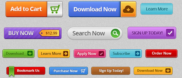
Example:
- "Download Your Free Guide"
- "Get Started Today"
- "Claim Your Discount"
- "Join Now"
Keep It Short: Use a few words and get to the point. Aim for a phrase 2-5 words long. Where there is too much text, it can be overwhelming or unclear.
2. Compelling Design:
- Contrasting Colors: Your CTA button should add to the rest of the page without overwhelming. Choose color that contrasts with your websites color scheme but remain within the boundaries of your brand. For instance, if it is a clean design, a very bold color like orange or green will make your CTA stand out.
- Consider Contrast: Button color and text should contrast enough with a background to be readable, especially for sight-impaired users. You can test colors using tools like WebAIM.
- Size Counts: The button needs to be large enough to be noticeable without being so big that it overwhelms other elements. Size should be such that the element will fit naturally with your design.
3. Placement:
- Above the Fold: The most effective CTA buttons are often placed “above the fold,” meaning they’re visible to users without needing to scroll. This ensures users see it right away, especially when they first land on the page.
- Multiple CTAs: Never depend on one CTA placed at the bottom of your page. Depending on your content size, you might place multiple call-to-action buttons across your content page (such as at top, middle, and bottom of a blog).
- Contextual Placement: Keep your CTAs close to the relevant content. Put a "Sign Up" button next to a testimonial, or a "Buy Now" button below product descriptions. That way, the CTA is right next to the content the user is trying to interact with.
4. Use Action-Oriented Language:
- Encourage Action: Use verbs that push users to take action right away. Words like "buy, get, start, join, discover, or save" motivate clicks by promising an immediate reward or outcome.
- Create a Sense of Urgency: Words that denote time sensitivity can nudge users to make a decision now. Phrases like "Limited Offer," "Act Now," or "Sign Up Today" create a sense of urgency, prompting users to click sooner rather than later.
5. Whitespace and Surrounding Elements:
Clear Surrounding Space Make sure there is sufficient whitespace around the CTA button so it stands out. Overcrowding the button with many elements or text makes it less likely to get noticed.
Minimize Cluttering Don't have too many competing calls-to-action on one page. Having only one primary call-to-action per page or section minimizes the amount of distraction and helps users focus on what you want them to do.
6. Visual Feedback:
- Hover Effects: Adding hover effects, such as changing the color, introducing a shadow, or animation, would give the button an interactivity feel and instant feedback to the user that the button is clickable.
- Active States: After clicking, make the button slightly darker so that the user knows the action is being processed. This will assure the user that their actions are being taken into account.
7. Designing for Mobile:
- Responsiveness: Your CTA button has to be easy to click on a mobile device. Ensure that your buttons are big enough so that the users need not zoom them in and far enough from the other clickable elements on the page.
- Mobile Visibility: Given that mobile screens often are space-limited, the CTA button should be visible without having to scroll, preferably to be on view for all primary actions such as signing up, making a purchase, or initiating a free trial.
8. Test and Optimize:
- A/B Testing: Run different versions of your CTA buttons to know which one converts the best. Try testing text, design, placement, and color to understand what drives the highest conversion rates.
- Track metrics: Utilize such analytics tools as Google Analytics or Hotjar to measure call-to-action performance. Such metrics as click-through rates and conversion rates will provide a good view of whether your CTA buttons are effective or not, so you can see where you could improve.
9. Provide a Clear Path to Action:
- Support copy: The words surrounding your CTA button explain to the user what he gets in return by clicking on that button. Additional context and value to the user. For example, use supporting statements like:
"Start your 30-day free trial today!"
"No credit card required!"
"Join over 1,000 happy customers!"
- No Confusion: Avoid the use of conflicting CTAs for example, "Buy Now" and "Learn More" across the same space. Instead, have one main CTA per page or section that takes the user on a clear, directed journey.
10. Contemplate the User's Journey:
- Tailored CTAs: Where possible, tailor the CTA to where the user is within their journey. For example:
- New Visitors: A button such as "Learn More" or "See How It Works" helps introduce them to your product.
- Engaged Visitors: A "Start Free Trial" or "Buy Now" button is better suited for those ready to take action.


No comments:
Post a Comment