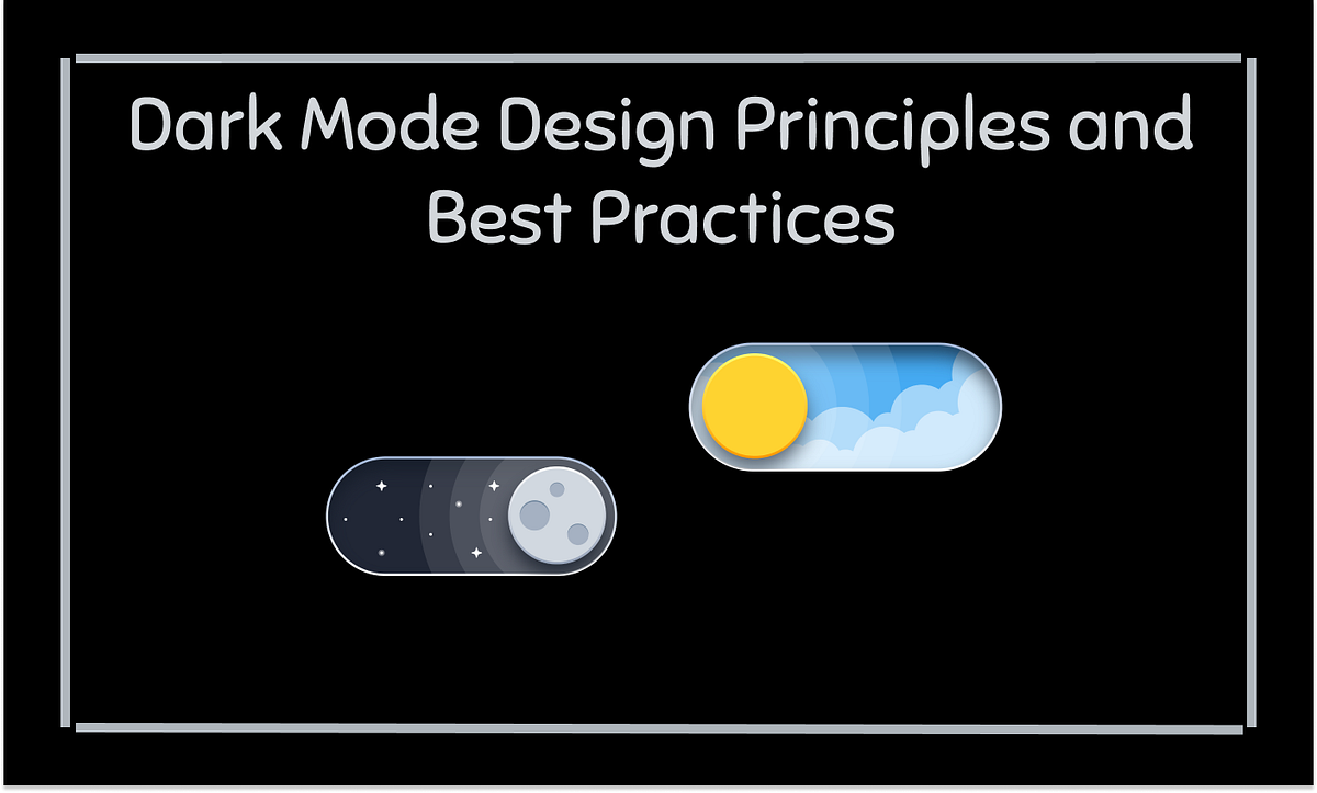
1. Understand the Purpose of Dark Mode:

- Reduced glare and eye strain.
- A sleek, modern look that complements the light mode version of the site or app.
- A design that maintains legibility and accessibility.
2. Choose the Right Background Colors:

- For dark mode, use dark gray, such as #121212 to #1a1a1a, instead of pure black (#000000).
- Dark gray reduces harsh contrast and is easier on the eyes during long reading sessions.
- Pure black might cause eye strain due to its high contrast. It will be a better design, achieving good readability and user experience without being too overwhelming.
3. Adjust Text for Readability:

- Use light gray text (e.g., #E0E0E0) instead of pure white to prevent eye strain.
- Ensure a contrast ratio of at least 4.5:1 between text and background for readability.
- Make headings bolder or slightly brighter than body text for clear content hierarchy.
4. Use Color Thoughtfully:
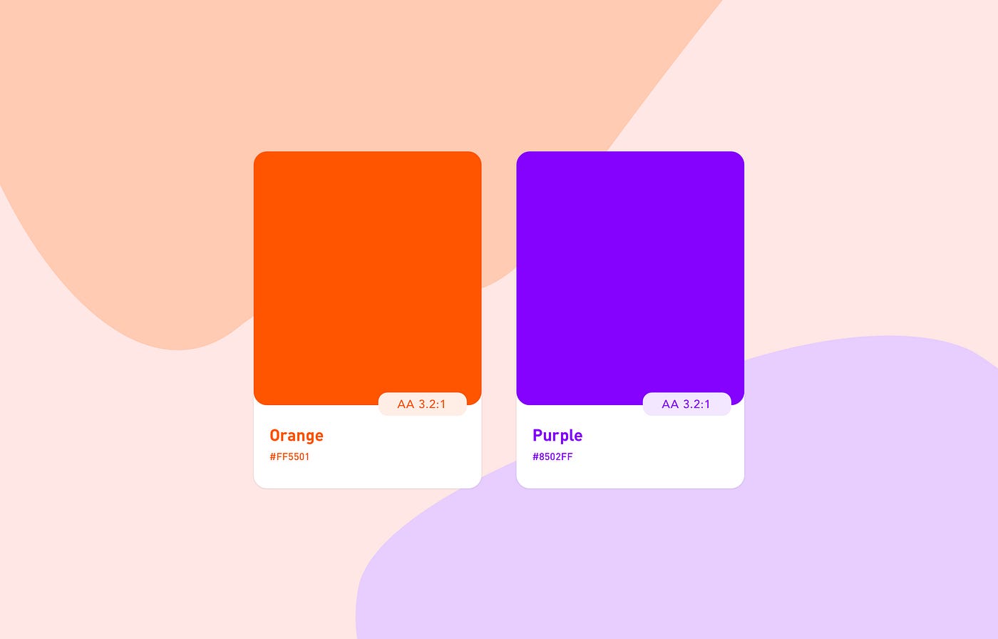
- For buttons, links, and notifications, use the bright accent color, but for obvious reasons, sparingly so as not to overwhelm users.
- Use blue (#1E90FF) on dark backgrounds as a color for links and highlighted text; it stands out well.
- To remain balanced and comfortable, but not visually tired, stick to the use of desaturated colors for background elements.
5. Optimize Images for Dark Mode:

- Ensure transparent logos/icons are okay on dark backgrounds, definitely light-colored logos.
- Brightness adjustment so images will not appear too dark when in dark mode.
- Avoid light borders on an image and prevent visual noise; consider instead subtle or no borders at all.
6. Subtle Shadows and Elevation:

- Use softer shadows, which are light and subtle, to prevent the content from being overcrowded and to maintain a smooth look.
- Adjust for depth by ensuring elements like buttons or cards stand out with subtle contrast, without using harsh shadows that could look out of place in dark mode.
7. Ensure Accessibility for All Users:

- Ensure contrast ratios meet WCAG criteria for readable text and background elements.
- Limit blue light exposure by using warmer tones, especially for apps or sites used for extended periods.
- Consider color blindness: provide using textures or patterns next to colors, or labeling colors.
8. Test the Design in Various Lighting Conditions:
- Test your design on multiple devices-smartphones, tablets, and desktops- to ensure that it works on different screens under different lighting.
- Use a design tool like Figma or Adobe XD to preview either dark mode or use developer tools to simulate conditions and check the accessibility and visual consistency.
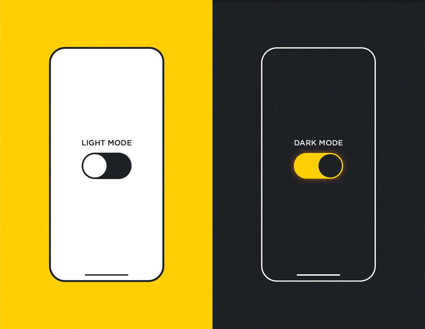
9. Provide a Toggle for Users:

- Add mode toggle that allows its user to easily switch between light and dark modes. EX:button or setting.
- Respect system preference by automatically switching the mode of the website according to the OS set on the user's device, for example Windows, macOS, iOS, Android.
10. Maintain Consistency Between Light and Dark Mode:
- Add mode toggle that allows its user to easily switch between light and dark modes. Example- A button or setting.
- Respect system preference by automatically switching the mode of the website according to the OS set on the user's device, for example Windows, macOS, iOS, Android.
Designing for dark mode presents so many compromises between aesthetic and functional balance and user comfort. Follow best practices for color, typography, image optimization, and accessibility to ensure a smooth and friendly user experience. Testing and feedback from other users will help refine your design. With the right approach, dark mode can be one of the most valuable and enjoyable features in your web or app design.
"We Can Help You Build Your Website – Contact Us Now!"


No comments:
Post a Comment