
Website navigation improves the user experience, simplifies your website, and guides visitors to exactly what they need in minimal time. Here are some tips that could optimize your website's navigation:
1. Simplify the Menu Structure:

- Limit menu items: Do not clutter up the navigation by overstuffing it with options. Opt for 5-7 primary categories.
- Clear Labels: menu items have to be self-explanatory, so a user clicks knowing exactly what is going to pop up, for instance "About Us" instead of just "Company".
- Prioritize key pages place your most important pages (e.g.,home, services,contact) at top level navigation.
2. Use a Sticky or Fixed Navigation Bar:

A sticky or fixed navigation bar stays visible as users scroll down a page and provides several benefits:
Improve usability: Users can access important links quickly without having to scroll back to the top.
Increased conversions: Keeps key buttons (e.g., "Sign Up" or "Contact Us") always visible, encouraging action.
Consistency & accessibility: It provides easy navigation access on all pages, especially on long or mobile-friendly sites.
3. Implement Breadcrumb Navigation:
- Hierarchical Structure: Breadcrumbs are a trail of links that indicate the location where a user is on the site's hierarchy. The users can easily find themselves back to the higher level pages without confusion.
4. Mobile-Friendly Design:

- Responsive Navigation: Ensure that navigation works seamlessly across all devices. Use a hamburger menu or a collapsible navigation bar for smaller screens to save space.
- Touch-Friendly Elements: Buttons and links should be large enough to click or tap on mobile devices.
5. Search Functionality:
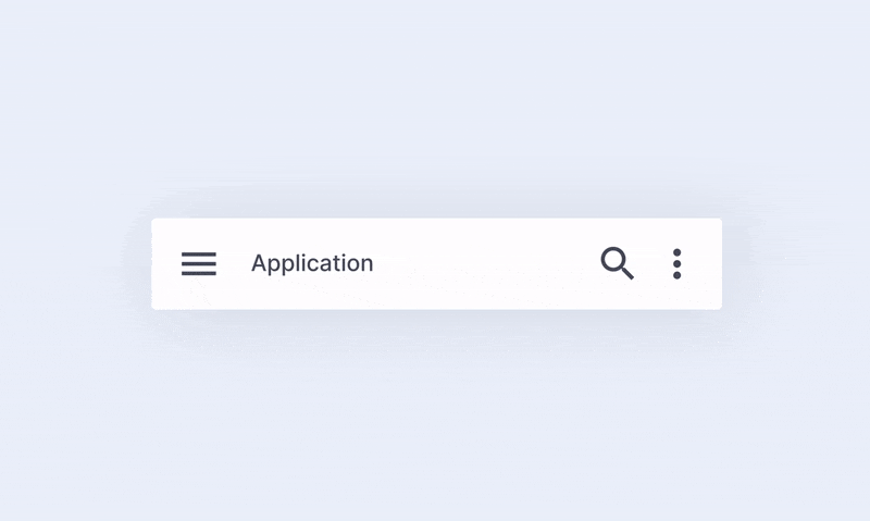
- Visible Search Bar: Include an easily accessible search bar, especially if your website has a lot of content. Make sure it is in a consistent location, like the top-right corner.
- Autocompletion & Suggestions: Enable search suggestions or autocompletion to help users find what they’re looking for faster.
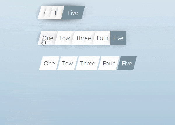
6. Highlight Active Pages:
- Visual Cues: Use color changes, underlining, or highlighting to indicate the active page or section within the menu, making it clear where the user is on your site.
7. Use Descriptive Dropdowns:
- Organize Subcategories: Dropdowns should be organized logically. Avoid overly complex menus and try to keep them simple, with clear options.
- Limit Hover to Click: Prefer click-based dropdowns over hover-based ones to avoid accidental clicks or confusion, particularly on mobile devices.
8. Ensure Consistency:
- Uniform Structure: Keep the navigation consistent across all pages, with the same layout and links. Avoid unnecessary changes to navigation menus between pages.
- Follow Conventions: Position the main navigation bar at the top or on the left side (for desktop) as users expect.
9. Add a Sitemap:
- Clear Overview: Include a sitemap, particularly for larger websites. This helps users and search engines understand the website's structure and easily find any page.


No comments:
Post a Comment