Monday, 2 December 2024

How to Create Web Design Prototypes


1. Know the Needs:

  • Client or Stakeholder Input: Get all necessary details about the project. Understand the target audience, purpose, and desired functionalities.
  • User Experience (UX) Research: Study user behavior, preferences, and potential challenges. Use personas and user journeys to guide decisions.


2. Sketch Your Ideas:

  • Pen and Paper: Begin with rough sketches to map out basic layouts and structures.
  • Wireframing Tools: Use tools like Figma, Sketch, Adobe XD, or Balsamiq for more precise wireframes.


3. Choose the Right Tools:

  • Static Prototypes: Use Adobe XD, Figma, Sketch, or InVision for designs that showcase layout and visuals.
  • Interactive Prototypes: Use tools like Proto.io, Axure RP, or Framer to add click-through functionality.


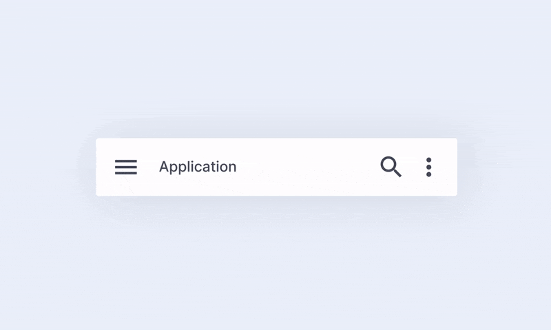
4. Design the User Interface (UI):

  • Visual Design: Select a consistent color scheme, typography, and iconography based on the brand guidelines.
  • Grid and Layout: Use grid systems to maintain alignment and responsiveness.


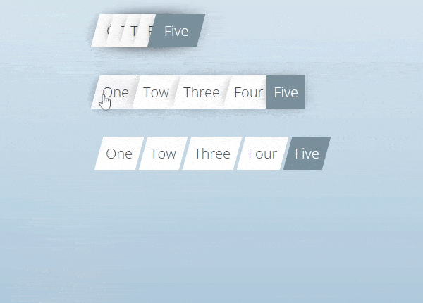
5. Create Interactive Elements:

  • Clickable Buttons: Simulate navigation between pages.
  • Hover States: Highlight interactive areas for better user experience.
  • Animations and Transitions: Showcase the behavior of elements like modals, sliders, or dropdown menus.


6. Test and Refine:

  • User Testing: Gather feedback from stakeholders or a test group.
  • Refine Designs: Based on feedback, make necessary adjustments to improve usability and aesthetics.


7. Document and Share:

  • Export Files: Export the prototype in formats suitable for developers (e.g., specs, assets).
  • Collaborate: Share the prototype with your team or stakeholders using tools like Figma’s live sharing or InVision.


8. Hand Off to Developers:

  • Style Guides: Provide a style guide or design system to ensure consistency.
  • Annotations: Include notes about functionality, behavior, or other implementation details.


 "Find Out What Your Website’s Missing – Let’s Talk Today"

Saturday, 30 November 2024

How to Use Adobe XD for Web Design


adobe XD

What is Adobe XD?

Adobe XD is a vector-based design and prototyping tool for web, mobile apps, and other digital interfaces. The tool allows designers to make wireframes, interactive prototypes, and high-fidelity designs. Its features streamline the workflow for creating modern web experiences.

Features of Adobe XD for Web Design:

1. Design Features

  • Vector-Based Design: Easily scalable and ideal for web and app interfaces.
  • Responsive Resize: Automatically adjusts UI elements for different screen sizes.
  • Repeat Grid: Reuse parts like lists or image grids and avoid time-wasting tasks in repetitions.
  • Components (Symbols): Reusable design elements which also support global updates
  • Plugins and Integrations: Enhance functionality through stock image, icon, and animation plugins

2. Prototyping Features:

  • Interactive Prototyping: Connect screens to each other and add transitions for a click-able prototype
  • Auto-Animate: Generate smooth animations between artboards to make transitions look fluid and smooth
  • Voice Prototyping: Add voice triggers and responses to designs to give a complete immersive feel.
  • Overlays: Apply overlays for menus, modals, or pop-ups without introducing a new screens.


3. Collaboration:

  • Co-editing: Work simultaneously with any number of contributors.
  • Share for Review: Share your design and receive comments on the prototype.
  • Developer Handoff: Share a link to get automatic specifications and assets to the developers


 4. Cross-Platform and Cloud Integration:

  • Cloud Storage: Connect easily to Adobe Creative Cloud to save and share your files.
  • Cross-Device Preview: Test your designs on real devices using the Adobe XD app.

Key Benefits for Web Designers:

  • Speed and Efficiency: Features like Repeat Grid and Components reduce repetitive tasks.
  • Consistency: Styles and design assets can be reused for cohesive designs.
  • Integration with Adobe Ecosystem: Easily use assets from Photoshop, Illustrator, and other Adobe apps.
  • Interactivity: Prototyping tools make it easier to visualize the final product and get feedback early.

Web Design Workflow in Adobe XD:

  • Research and Planning: This includes structuring the website with assets gathering.
  • Wireframing: The low-fidelity wireframes that map out the structure.
  • Designing: With the artboards, a high-fidelity design takes center stage for typography, color, and UI components.
  • Prototyping: Adding interactions and animations to connect the pages.
  • Testing: Shared with stakeholders or tested on the device.
  • Handoff: Assets exported and shared for the developer specifications.

System Requirements:

  • Platforms: Available for macOS and Windows.
  • Mobile Support: Adobe XD app for iOS and Android for prototype testing.
  • Hardware Needs: Requires a modern computer with adequate RAM and GPU for optimal performance.

Alternatives:

  • Figma: Browser-based and excels in collaboration.
  • Sketch: Popular among macOS users but lacks Windows support.
  • InVision Studio: Focused on advanced animations and prototyping.


Pricing:

Adobe XD is available via subscription:
  • Free Plan: Limited to one shared document and prototype.
  • Paid Plan: Part of the Adobe Creative Cloud subscription or as a standalone app.

Figma complete imformation

Figma complete Imformation


1. What is Figma?

Figma is a vector-based design tool that directly runs in the browser, with desktop apps for macOS and Windows. It's excellent for teams due to its real-time collaboration.


2. Key Features for Web Design:

a. Design Tools:

  • Vector Networks: Build scalable and responsive designs with vectors.
  • Auto Layout: Quickly create responsive layouts that automatically change with changes in content or screen size.
  • Reusable Components: Develop components (buttons, headers, etc.) that are reusable and can be updated everywhere.
  • Interactive Prototypes: Connect pages and add interaction to demonstrate user flows.


b. Collaboration:

  • Realtime editing for multiple users.
  • Commenting system for feedback and discussion.
  • Version history that tracks the changes.

c. Accessibility:

  • Cloud-based, so it can be accessed with an internet connection from anywhere.
  • Integrations with tools like Slack, Jira, and Notion.

d. Export Options:

  • Export the designs as PNG, JPG, SVG, or PDF.
  • Generate CSS, iOS, and Android code for developers

e. Plugins:

A huge library of plugins available for:

  • Stock images: Unsplash, Pexels.
  • Icons: Feather Icons, Font Awesome.
  • Productivity tools: Spellchecker, Content Generator.


Steps to Design a Website in Figma:

Step 1. Set Up the Canvas
  • Open Figma and create a new file.
  • Set up frames (artboards) for desktop, tablet and mobile views.
Step 2. Create a Wireframe:

  • Use simple shapes to mark the structure (header, footer, content areas).
  • Focus on layout and hierarchy before adding visuals.
Step 3. Build Components:

  • Design reusable elements like navigation bars, buttons, and cards.
  • Save them in a Components Library for consistency.

Step 4: Add Style:

  • Make use of the Style Guide by Figma for color definition, typography, and effects.
  • Apply uniform padding, margins, and spacing by making use of Auto Layout.
Step 5: Prototyping:

  • Connect frames with interactions (such as hover effects and page transitions).
  • Test the user journey right within Figma.
Step 6: Share and Collaborate:

  • Share the file link with the stakeholders for feedback.
  • Revisions using comments.
Step 7: Handoff to Developer:

  • Developers can view designs, copy CSS code, and export assets from Figma.

4. Benefits of Figma:

  • Cross-device: Works on any OS with a browser.
  • Live collaboration: Great for distributed teams.
  • Easy hand-off: Makes the design-to-develop process easier.
  • Free version exists: Provides enough functionality for smaller teams and individuals.

5. Drawbacks:

  • Relies on Internet Connection for full functionality
  • Very minimal functionality with Offline usage.
  • May be challenging for some novices to learn.

6. Figma Pricing:

  • Free Plan: For individuals and small projects.
  • Professional Plan: $12/user/month for unlimited version history and advanced features.
  • Organization Plan: $45/user/month for enterprises with added security and analytics.

Friday, 29 November 2024

Photoshop vs Sketch: Which One is Best for Web Design?


Photoshop

Pros:

  • Versatility: Photoshop is a powerful tool for designing anything from UI elements to photo manipulation and print design. It’s suitable if you need to combine web design with tasks like editing images or creating graphics.
  • Cross-Platform: Available on both Windows and macOS, making it accessible to a broader audience.
  • Advanced Tools: Offers a wide range of features for pixel-perfect designs, such as detailed layer styles, precise masking, and advanced color correction.
  • Integration with Adobe Suite: Works seamlessly with other Adobe products like Illustrator and XD, which can be helpful for complex projects.

Cons:

  • Not Web Design-Centric: Photoshop is a general-purpose tool, so it lacks features specific to web design, such as built-in grid systems, easy prototyping, or responsive design previews.
  • Learning Curve: Its comprehensive feature set can be overwhelming for beginners.
  • File Sizes: Photoshop files (PSD) tend to be larger, which can slow down collaboration and performance.
  • Subscription Cost: Part of Adobe Creative Cloud, which requires a monthly subscription.


Sketch

Pros:

  • Purpose-Built for UI/Web Design: Sketch is tailored for creating web and app interfaces, offering tools like symbols, artboards, and responsive grid systems.
  • Lightweight and Fast: Its simple interface and web design focus make it quicker to use for specific tasks.
  • Prototyping Features: Includes built-in prototyping and collaboration tools, reducing the need for third-party apps.
  • Community and Plugins: A strong community supports Sketch with plugins for advanced functionality, such as auto-layouts, exporting assets, or integrating with developer tools.
  • Vector-Based: Better for responsive and resolution-independent designs compared to Photoshop’s raster foundation.
  • Cost-Effective: A one-time purchase (with optional upgrades) rather than a subscription.

Cons:

  • macOS Only: Exclusively available for macOS, which limits its use for Windows-based designers.
  • Image Editing Limitations: Not as robust as Photoshop for tasks like photo manipulation or raster image editing.
  • Less Comprehensive: Limited support for broader graphic design or multimedia tasks outside of UI/UX design.


The Role of Frontend and Backend in Web Design


Frontend Development:

The frontend is the side of a website or application that is viewable by users. It emphasizes everything the user will encounter.


Key Responsibilities:

  1. User Interface(UI) Design: Incorporating visual and layout aspects via HTML, CSS, and JavaScript.
  2. Interactivity: Animated and interactive functionalities (such as animations, buttons, forms) implemented through JavaScript, as well as by frameworks such as React, Angular, or Vue.js.
  3. Responsive: Creating responsive designs for a website that adapts to different screen sizes and devices, using techniques such as media queries, flexbox, and grid.
  4. Performance Optimization: Optimize images, code, and other assets to ensure fast loading and smooth user experience.
  5. Accessibility: Follow standards like WCAG to ensure the site is accessible to people with disabilitie.
  6. Cross-Browser Compatibility: Test and correct issues for consistent functionality across various web browsers.

Key Technologies:

  • Languages: HTML, CSS, JavaScript
  • Frameworks/Libraries: React, Angular, Vue.js, Bootstrap
  • Tools: Webpack, Babel, Figma (for design collaboration)

Backend Development:

The backend is the server side of a website or application. It is where data, logic, and infrastructure are managed to support the front end.


Main Tasks:

  1. Server Management: Server setup, configuration, and maintenance for hosting applications.
  2. Database Integration: Designing and managing databases for efficient storage and retrieval of data, such as user profiles, content, and transactions.
  3. Business Logic: Writing server-side code to process user input, perform calculations, and implement features.
  4. API Development: Creating RESTful or GraphQL APIs to allow communication between the frontend and backend.
  5. Authentication and Security: Managing user authentication, data encryption, and other security measures to protect sensitive information.
  6. Performance and Scalability: Ensuring the application can handle high traffic and scale effectively.

Key Technologies:

  • Languages: Python, Java, Ruby, PHP, JavaScript (Node.js)
  • Frameworks: Django, Flask, Ruby on Rails, Express.js
  • Databases: MySQL, PostgreSQL, MongoDB
  • Tools: Docker, Kubernetes, Nginx, Apache

Wednesday, 27 November 2024

How to Improve Website Navigation?


Website navigation improves the user experience, simplifies your website, and guides visitors to exactly what they need in minimal time. Here are some tips that could optimize your website's navigation:

1. Simplify the Menu Structure:

  • Limit menu items: Do not clutter up the navigation by overstuffing it with options. Opt for 5-7 primary categories.
  • Clear Labels: menu items have to be self-explanatory, so a user clicks knowing exactly what is going to pop up, for instance "About Us" instead of just "Company".
  • Prioritize key pages place your most important pages (e.g.,home, services,contact) at top level navigation.


2. Use a Sticky or Fixed Navigation Bar:


A sticky or fixed navigation bar stays visible as users scroll down a page and provides several benefits:

Improve usability: Users can access important links quickly without having to scroll back to the top.
Increased conversions: Keeps key buttons (e.g., "Sign Up" or "Contact Us") always visible, encouraging action.
Consistency & accessibility: It provides easy navigation access on all pages, especially on long or mobile-friendly sites.

3. Implement Breadcrumb Navigation:


  • Hierarchical Structure: Breadcrumbs are a trail of links that indicate the location where a user is on the site's hierarchy. The users can easily find themselves back to the higher level pages without confusion.


4. Mobile-Friendly Design:


  • Responsive Navigation: Ensure that navigation works seamlessly across all devices. Use a hamburger menu or a collapsible navigation bar for smaller screens to save space.
  • Touch-Friendly Elements: Buttons and links should be large enough to click or tap on mobile devices.
5. Search Functionality:

  • Visible Search Bar: Include an easily accessible search bar, especially if your website has a lot of content. Make sure it is in a consistent location, like the top-right corner.
  • Autocompletion & Suggestions: Enable search suggestions or autocompletion to help users find what they’re looking for faster.


6. Highlight Active Pages:

  • Visual Cues: Use color changes, underlining, or highlighting to indicate the active page or section within the menu, making it clear where the user is on your site.

7. Use Descriptive Dropdowns:

  • Organize Subcategories: Dropdowns should be organized logically. Avoid overly complex menus and try to keep them simple, with clear options.
  • Limit Hover to Click: Prefer click-based dropdowns over hover-based ones to avoid accidental clicks or confusion, particularly on mobile devices.

8. Ensure Consistency:

  • Uniform Structure: Keep the navigation consistent across all pages, with the same layout and links. Avoid unnecessary changes to navigation menus between pages.
  • Follow Conventions: Position the main navigation bar at the top or on the left side (for desktop) as users expect.

9. Add a Sitemap:

  • Clear Overview: Include a sitemap, particularly for larger websites. This helps users and search engines understand the website's structure and easily find any page.


The Impact of Microinteractions on Web Design


Micro-interaction is small, subtle, and often unnoticed interaction which goes on within the user interface. These interactions are basically given for feedback purposes, the conveyance of information and also to improve the usability experience. It may appear to be minor, but with this, one can build significant user experience.


Before we delve deeper into it, let's consider some examples and benefits of Microinteractions that can improve user experience:


  • A button changes color or shape when clicked; the visual feedback that the action was successful
  • A loading spinner that appears while a page or feature is loading informs the user that the system is working and prevents frustration about perceived inaction.
  • A toggle switch that animate smoothly between on and off positions, giving a satisfying tactile experience to the user.
  • A progress bar showing how much a user is progressing within a process. This builds a sense of accomplishment and reduces anxiety about how long it might take to finish a particular task.
  • A hover effect that offers additional information or context about the content of an element on the page for added informational clarity for the user

Microinteractions can benefit the UI/UX design in the following ways:

  • They can enhance the user experience by offering feedback and guidance to the user.
  • They can improve the user's comprehension of the information on the page
  • They will make the interface look more aesthetically interesting and attractive
  • They can produce an experience of joy or satisfaction for the user, thus enhancing the general impression created by the product or brand.

Best Patterns Generator Websites for Your Design

  1. Pattern Monster Free online tool to generate seamless SVG patterns. Customizable colors, shapes, and scales. Download in multiple forma...