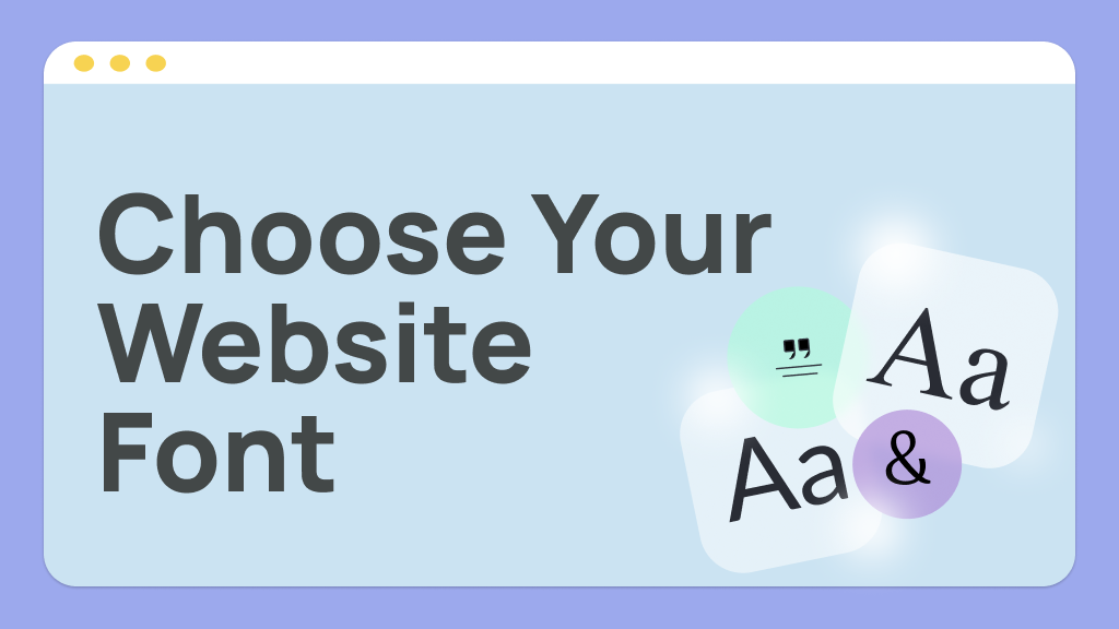
1. Fonts Role in Web Design:
Readability: Clear fonts improve the usability of content in a website.
Brand Personality: The font chosen might express the tone and identity of your brand.
Visual Hierarchy: Fonts help organize the different contents of the website and guide users towards essential sections.
User Engagement: The correct font selection can make the website more attractive and engaging.
2. Types of Fonts in Web Design:
Serif Fonts: These fonts possess small lines or ornaments at the ends of the letters (e.g., Times New Roman, Georgia).
Best For: Traditional, professional, formal websites like news sites, magazines, and law firms.
Sans-Serif Fonts: These fonts don't have the added lines. (Examples: Arial, Helvetica, and Roboto).
Best Used For: Trendy, clean, minimalist designs. Ideally suited for tech-related, start-up, or websites that require a fresher and more legible look on digital screens.
Script Fonts: These are cursive writing or calligraphy-style fonts (for example, Pacifico, Brush Script).
Best Used For: Decorative or creative web pages, branded words or logos, or occasional headings for content.
Display Fonts: These are stylized and catch attention (for example, Bebas Neue, Impact).
Best For: Headlines and headings, ads, or any attention-grabbing writing.
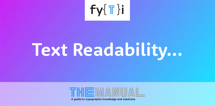
3. Readability and Legibility:
Size Matters: Your font sizes are important enough to make sure they're not too small to read easily. For body text, a size of 16px works, but the font will depend.
Line Height: Keep an acceptable line spacing (usually 1.5x the font size) so that text doesn't get too tight.
Contrast: Ensure that there is enough contrast between the text and its background. Text on a light background should be dark in color, and vice versa.
4.Use Web-Safe Fonts or Web Font Services:
Web-safe fonts (e.g., Arial, Verdana) are pre-installed on most devices.
Use services like Google Fonts or Adobe Fonts for more options.
5. Brand Personality and Tone:
The different fonts you select for your brand should reflect its personality and tone. Fonts communicate differently:
Serif Fonts: These communicate professionalism, tradition, and reliability. Good for legal, educational, news sites.
Sans-Serif Fonts: These communicate modernity, cleanliness, and simplicity. Great for tech companies, startups, creative brands.
Script Fonts: These evoke elegance, creativity, or playfulness. Best suited for fashion, beauty, or artistic brands.
Display Fonts: This conveys boldness and creativity, great for entertaining, fashion, or artistic websites.
6. Consistency for the Entire Website:
Consistency in font usage helps maintain a cohesive design:
Utilize the same font for headings, subheadings, and body text.
Use the same type of fonts throughout various website sections (such as blogs, contact pages, product listings) for consistency.
9. Matching Typesetting Provide matching typesetting. There are several ideas on how to match different types of fonts, and here are a few tips:
Contrast: Combine a dramatic, attention-grabbing font (serif or display font) with a cleaner, easier-to-read one (sans-serif).
No Too Similar Fonts: If the fonts are too similar, it can make a mess on your page. Seek out text with contrasting characteristics-one might be serif and the other sans-serif.
Use Font Weight: Another way to create contrast is by using the same family but changing weights (regular, bold, italic).
1. Top Web Fonts Used in Modern Design:
Some popular web fonts used in modern design include:
Roboto: A clean, modern sans-serif font that's incredibly readable.
Open Sans: Another very popular sans-serif, used both as body and headings.
Lora: More traditional feel, and best for content-heavy sites.
Montserrat: A bold, modern sans-serif that's a favorite for headings and titles.
Merriweather: A classic serif font, optimized for screen reading, for long content blocks.