Saturday, 30 November 2024

How to Use Adobe XD for Web Design


adobe XD

What is Adobe XD?

Adobe XD is a vector-based design and prototyping tool for web, mobile apps, and other digital interfaces. The tool allows designers to make wireframes, interactive prototypes, and high-fidelity designs. Its features streamline the workflow for creating modern web experiences.

Features of Adobe XD for Web Design:

1. Design Features

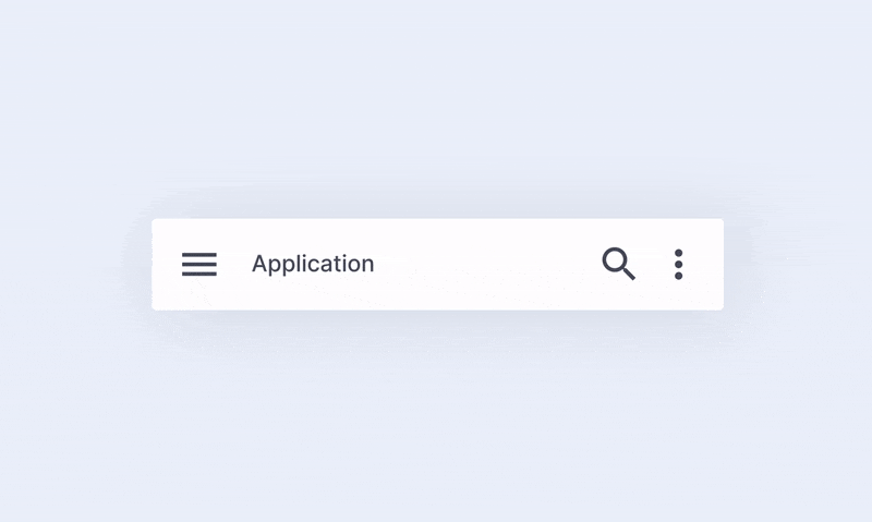
  • Vector-Based Design: Easily scalable and ideal for web and app interfaces.
  • Responsive Resize: Automatically adjusts UI elements for different screen sizes.
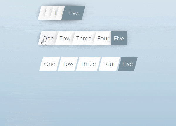
  • Repeat Grid: Reuse parts like lists or image grids and avoid time-wasting tasks in repetitions.
  • Components (Symbols): Reusable design elements which also support global updates
  • Plugins and Integrations: Enhance functionality through stock image, icon, and animation plugins

2. Prototyping Features:

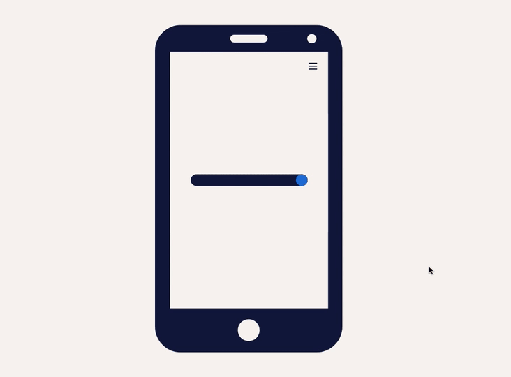
  • Interactive Prototyping: Connect screens to each other and add transitions for a click-able prototype
  • Auto-Animate: Generate smooth animations between artboards to make transitions look fluid and smooth
  • Voice Prototyping: Add voice triggers and responses to designs to give a complete immersive feel.
  • Overlays: Apply overlays for menus, modals, or pop-ups without introducing a new screens.


3. Collaboration:

  • Co-editing: Work simultaneously with any number of contributors.
  • Share for Review: Share your design and receive comments on the prototype.
  • Developer Handoff: Share a link to get automatic specifications and assets to the developers


 4. Cross-Platform and Cloud Integration:

  • Cloud Storage: Connect easily to Adobe Creative Cloud to save and share your files.
  • Cross-Device Preview: Test your designs on real devices using the Adobe XD app.

Key Benefits for Web Designers:

  • Speed and Efficiency: Features like Repeat Grid and Components reduce repetitive tasks.
  • Consistency: Styles and design assets can be reused for cohesive designs.
  • Integration with Adobe Ecosystem: Easily use assets from Photoshop, Illustrator, and other Adobe apps.
  • Interactivity: Prototyping tools make it easier to visualize the final product and get feedback early.

Web Design Workflow in Adobe XD:

  • Research and Planning: This includes structuring the website with assets gathering.
  • Wireframing: The low-fidelity wireframes that map out the structure.
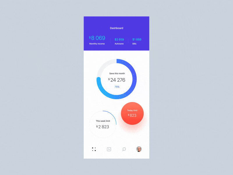
  • Designing: With the artboards, a high-fidelity design takes center stage for typography, color, and UI components.
  • Prototyping: Adding interactions and animations to connect the pages.
  • Testing: Shared with stakeholders or tested on the device.
  • Handoff: Assets exported and shared for the developer specifications.

System Requirements:

  • Platforms: Available for macOS and Windows.
  • Mobile Support: Adobe XD app for iOS and Android for prototype testing.
  • Hardware Needs: Requires a modern computer with adequate RAM and GPU for optimal performance.

Alternatives:

  • Figma: Browser-based and excels in collaboration.
  • Sketch: Popular among macOS users but lacks Windows support.
  • InVision Studio: Focused on advanced animations and prototyping.


Pricing:

Adobe XD is available via subscription:
  • Free Plan: Limited to one shared document and prototype.
  • Paid Plan: Part of the Adobe Creative Cloud subscription or as a standalone app.

Figma complete imformation

Figma complete Imformation


1. What is Figma?

Figma is a vector-based design tool that directly runs in the browser, with desktop apps for macOS and Windows. It's excellent for teams due to its real-time collaboration.


2. Key Features for Web Design:

a. Design Tools:

  • Vector Networks: Build scalable and responsive designs with vectors.
  • Auto Layout: Quickly create responsive layouts that automatically change with changes in content or screen size.
  • Reusable Components: Develop components (buttons, headers, etc.) that are reusable and can be updated everywhere.
  • Interactive Prototypes: Connect pages and add interaction to demonstrate user flows.


b. Collaboration:

  • Realtime editing for multiple users.
  • Commenting system for feedback and discussion.
  • Version history that tracks the changes.

c. Accessibility:

  • Cloud-based, so it can be accessed with an internet connection from anywhere.
  • Integrations with tools like Slack, Jira, and Notion.

d. Export Options:

  • Export the designs as PNG, JPG, SVG, or PDF.
  • Generate CSS, iOS, and Android code for developers

e. Plugins:

A huge library of plugins available for:

  • Stock images: Unsplash, Pexels.
  • Icons: Feather Icons, Font Awesome.
  • Productivity tools: Spellchecker, Content Generator.


Steps to Design a Website in Figma:

Step 1. Set Up the Canvas
  • Open Figma and create a new file.
  • Set up frames (artboards) for desktop, tablet and mobile views.
Step 2. Create a Wireframe:

  • Use simple shapes to mark the structure (header, footer, content areas).
  • Focus on layout and hierarchy before adding visuals.
Step 3. Build Components:

  • Design reusable elements like navigation bars, buttons, and cards.
  • Save them in a Components Library for consistency.

Step 4: Add Style:

  • Make use of the Style Guide by Figma for color definition, typography, and effects.
  • Apply uniform padding, margins, and spacing by making use of Auto Layout.
Step 5: Prototyping:

  • Connect frames with interactions (such as hover effects and page transitions).
  • Test the user journey right within Figma.
Step 6: Share and Collaborate:

  • Share the file link with the stakeholders for feedback.
  • Revisions using comments.
Step 7: Handoff to Developer:

  • Developers can view designs, copy CSS code, and export assets from Figma.

4. Benefits of Figma:

  • Cross-device: Works on any OS with a browser.
  • Live collaboration: Great for distributed teams.
  • Easy hand-off: Makes the design-to-develop process easier.
  • Free version exists: Provides enough functionality for smaller teams and individuals.

5. Drawbacks:

  • Relies on Internet Connection for full functionality
  • Very minimal functionality with Offline usage.
  • May be challenging for some novices to learn.

6. Figma Pricing:

  • Free Plan: For individuals and small projects.
  • Professional Plan: $12/user/month for unlimited version history and advanced features.
  • Organization Plan: $45/user/month for enterprises with added security and analytics.

Friday, 29 November 2024

Photoshop vs Sketch: Which One is Best for Web Design?


Photoshop

Pros:

  • Versatility: Photoshop is a powerful tool for designing anything from UI elements to photo manipulation and print design. It’s suitable if you need to combine web design with tasks like editing images or creating graphics.
  • Cross-Platform: Available on both Windows and macOS, making it accessible to a broader audience.
  • Advanced Tools: Offers a wide range of features for pixel-perfect designs, such as detailed layer styles, precise masking, and advanced color correction.
  • Integration with Adobe Suite: Works seamlessly with other Adobe products like Illustrator and XD, which can be helpful for complex projects.

Cons:

  • Not Web Design-Centric: Photoshop is a general-purpose tool, so it lacks features specific to web design, such as built-in grid systems, easy prototyping, or responsive design previews.
  • Learning Curve: Its comprehensive feature set can be overwhelming for beginners.
  • File Sizes: Photoshop files (PSD) tend to be larger, which can slow down collaboration and performance.
  • Subscription Cost: Part of Adobe Creative Cloud, which requires a monthly subscription.


Sketch

Pros:

  • Purpose-Built for UI/Web Design: Sketch is tailored for creating web and app interfaces, offering tools like symbols, artboards, and responsive grid systems.
  • Lightweight and Fast: Its simple interface and web design focus make it quicker to use for specific tasks.
  • Prototyping Features: Includes built-in prototyping and collaboration tools, reducing the need for third-party apps.
  • Community and Plugins: A strong community supports Sketch with plugins for advanced functionality, such as auto-layouts, exporting assets, or integrating with developer tools.
  • Vector-Based: Better for responsive and resolution-independent designs compared to Photoshop’s raster foundation.
  • Cost-Effective: A one-time purchase (with optional upgrades) rather than a subscription.

Cons:

  • macOS Only: Exclusively available for macOS, which limits its use for Windows-based designers.
  • Image Editing Limitations: Not as robust as Photoshop for tasks like photo manipulation or raster image editing.
  • Less Comprehensive: Limited support for broader graphic design or multimedia tasks outside of UI/UX design.


The Role of Frontend and Backend in Web Design


Frontend Development:

The frontend is the side of a website or application that is viewable by users. It emphasizes everything the user will encounter.


Key Responsibilities:

  1. User Interface(UI) Design: Incorporating visual and layout aspects via HTML, CSS, and JavaScript.
  2. Interactivity: Animated and interactive functionalities (such as animations, buttons, forms) implemented through JavaScript, as well as by frameworks such as React, Angular, or Vue.js.
  3. Responsive: Creating responsive designs for a website that adapts to different screen sizes and devices, using techniques such as media queries, flexbox, and grid.
  4. Performance Optimization: Optimize images, code, and other assets to ensure fast loading and smooth user experience.
  5. Accessibility: Follow standards like WCAG to ensure the site is accessible to people with disabilitie.
  6. Cross-Browser Compatibility: Test and correct issues for consistent functionality across various web browsers.

Key Technologies:

  • Languages: HTML, CSS, JavaScript
  • Frameworks/Libraries: React, Angular, Vue.js, Bootstrap
  • Tools: Webpack, Babel, Figma (for design collaboration)

Backend Development:

The backend is the server side of a website or application. It is where data, logic, and infrastructure are managed to support the front end.


Main Tasks:

  1. Server Management: Server setup, configuration, and maintenance for hosting applications.
  2. Database Integration: Designing and managing databases for efficient storage and retrieval of data, such as user profiles, content, and transactions.
  3. Business Logic: Writing server-side code to process user input, perform calculations, and implement features.
  4. API Development: Creating RESTful or GraphQL APIs to allow communication between the frontend and backend.
  5. Authentication and Security: Managing user authentication, data encryption, and other security measures to protect sensitive information.
  6. Performance and Scalability: Ensuring the application can handle high traffic and scale effectively.

Key Technologies:

  • Languages: Python, Java, Ruby, PHP, JavaScript (Node.js)
  • Frameworks: Django, Flask, Ruby on Rails, Express.js
  • Databases: MySQL, PostgreSQL, MongoDB
  • Tools: Docker, Kubernetes, Nginx, Apache

Wednesday, 27 November 2024

How to Improve Website Navigation?


Website navigation improves the user experience, simplifies your website, and guides visitors to exactly what they need in minimal time. Here are some tips that could optimize your website's navigation:

1. Simplify the Menu Structure:

  • Limit menu items: Do not clutter up the navigation by overstuffing it with options. Opt for 5-7 primary categories.
  • Clear Labels: menu items have to be self-explanatory, so a user clicks knowing exactly what is going to pop up, for instance "About Us" instead of just "Company".
  • Prioritize key pages place your most important pages (e.g.,home, services,contact) at top level navigation.


2. Use a Sticky or Fixed Navigation Bar:


A sticky or fixed navigation bar stays visible as users scroll down a page and provides several benefits:

Improve usability: Users can access important links quickly without having to scroll back to the top.
Increased conversions: Keeps key buttons (e.g., "Sign Up" or "Contact Us") always visible, encouraging action.
Consistency & accessibility: It provides easy navigation access on all pages, especially on long or mobile-friendly sites.

3. Implement Breadcrumb Navigation:


  • Hierarchical Structure: Breadcrumbs are a trail of links that indicate the location where a user is on the site's hierarchy. The users can easily find themselves back to the higher level pages without confusion.


4. Mobile-Friendly Design:


  • Responsive Navigation: Ensure that navigation works seamlessly across all devices. Use a hamburger menu or a collapsible navigation bar for smaller screens to save space.
  • Touch-Friendly Elements: Buttons and links should be large enough to click or tap on mobile devices.
5. Search Functionality:

  • Visible Search Bar: Include an easily accessible search bar, especially if your website has a lot of content. Make sure it is in a consistent location, like the top-right corner.
  • Autocompletion & Suggestions: Enable search suggestions or autocompletion to help users find what they’re looking for faster.


6. Highlight Active Pages:

  • Visual Cues: Use color changes, underlining, or highlighting to indicate the active page or section within the menu, making it clear where the user is on your site.

7. Use Descriptive Dropdowns:

  • Organize Subcategories: Dropdowns should be organized logically. Avoid overly complex menus and try to keep them simple, with clear options.
  • Limit Hover to Click: Prefer click-based dropdowns over hover-based ones to avoid accidental clicks or confusion, particularly on mobile devices.

8. Ensure Consistency:

  • Uniform Structure: Keep the navigation consistent across all pages, with the same layout and links. Avoid unnecessary changes to navigation menus between pages.
  • Follow Conventions: Position the main navigation bar at the top or on the left side (for desktop) as users expect.

9. Add a Sitemap:

  • Clear Overview: Include a sitemap, particularly for larger websites. This helps users and search engines understand the website's structure and easily find any page.


The Impact of Microinteractions on Web Design


Micro-interaction is small, subtle, and often unnoticed interaction which goes on within the user interface. These interactions are basically given for feedback purposes, the conveyance of information and also to improve the usability experience. It may appear to be minor, but with this, one can build significant user experience.


Before we delve deeper into it, let's consider some examples and benefits of Microinteractions that can improve user experience:


  • A button changes color or shape when clicked; the visual feedback that the action was successful
  • A loading spinner that appears while a page or feature is loading informs the user that the system is working and prevents frustration about perceived inaction.
  • A toggle switch that animate smoothly between on and off positions, giving a satisfying tactile experience to the user.
  • A progress bar showing how much a user is progressing within a process. This builds a sense of accomplishment and reduces anxiety about how long it might take to finish a particular task.
  • A hover effect that offers additional information or context about the content of an element on the page for added informational clarity for the user

Microinteractions can benefit the UI/UX design in the following ways:

  • They can enhance the user experience by offering feedback and guidance to the user.
  • They can improve the user's comprehension of the information on the page
  • They will make the interface look more aesthetically interesting and attractive
  • They can produce an experience of joy or satisfaction for the user, thus enhancing the general impression created by the product or brand.

UI vs. UX Development: What's the Difference?


1. UI (User Interface):

A user interface refers to all those visual elements of a product which the users use or interact with. These could include layout, buttons, text, images, icons, and style.

Focus: The focus is on how good it looks and design the interface. It's UI designing, making sure everything is in place to look nice but not so that the elements are really difficult to work with.

Key Elements:

  • Layout: Placement of elements on the screen.
  • Color scheme: The palette of colors used in the design.
  • Typography: Fonts and text styles.
  • Icons & buttons: Interactive visual elements.
  • Responsiveness: The way in which the interface adapts to different screen sizes.
  • Goal: To create an interface that is visually pleasing and functionally useful enough to make the interaction as easy and intuitive as possible.

2. UX (User Experience):


UX is the overall experience a user has when in interaction with a product or service, which includes the ease and pleasure of being used. It looks beyond just the interface to the complete journey of the user from the beginning to the end.

Focus: UX focuses on how easily and smoothly a product may flow as it is being used; making it as intuitive and satisfying to a user to interact with.

Key components:

  • Usability: How user-friendly and intuitive the product is.
  • User Research: Knows what people want to do, what they can be expected to do, and what they struggle with.
  • Information Architecture: How the information is structured and accessible.
  • Interaction Design: How a person interacts with the product and how it reacts.
  • User Testing: Feedback for refining the experience.

Monday, 25 November 2024

Web Animation Techniques


1. Loading Animations:

  • Purpose: Used to indicate that content is loading or processing on a website.
  • Importance: They do not make the user feel frustrated by showing that some process is taking place in the background. Examples include spinning, progress bar, and moving dots.
  • Effect: They help shorten perceived waiting time and keep the user engaged during slow load times.


2. Scrolling Animations:

  • Purpose: Animations that fire as the user scrolls down the page.
  • Importance: They enable making long pages to be more engaging and lively by having content or animations that come up as someone scrolls down the page.
  • Effect: this creates an engaging storytelling experience, by which the user can feel more immersed in the content as it unfolds.

3. Hover Animations:

  • Purpose: These animations are caused when a user hovers their cursor over an element, like a button or image.
  • Importance: They feed back to users quickly, so it's clear that an element is interactive. On the button and link, they are used to change appearance such as the color, size, scale or shadow.
  • Effect: Hover effects increase the responsiveness feel and interactivity of an interface to make it even more intuitive.

4. Animated Backgrounds:

  • Purpose: Backgrounds that include motion or change over time, often used to create a visually dynamic atmosphere.
  • Importance: These animations can be subtle, like gradients shifting, or more complex, like moving shapes or video backgrounds.
  • Effect: The animated backgrounds contribute to the tone of the website and make it more interesting and visually appealing.


5. Page Motion Animations:

  • Purpose: Animations that occur when the user transitions between pages or sections.
  • Importance: These animations can provide a smoother, more engaging navigation experience by transitioning from one page or section to another in a fluid manner (e.g., slides, fades).
  • Effect: They reduce jarring page loads, giving the impression that the website is faster and more polished.

6. Dynamic Menu Options:

  • Purpose: Animated or changing menus that adjust according to user interaction, like the expansion of submenus, sliding panels, or the rotation of icons.
  • Importance: Dynamic menus make the navigation more interesting and optimize the space by showing what is needed at the moment.
  • Effect: Improves usability on the site in that menus are more intuitive to use, easy to navigate, and less cluttered.

7. Welcoming Animations:

  • Purpose Animations used as an introduction to the site when a user first arrives.
  • Importance: These may consist of splash screens, animated logos, or background movements that set the tone for the website and may give a good impression at first glance.
  • Effect: A welcome animation creates an identity for the brand and invites customers into an experience if the animation is reflective of the brand's personality.

8. Slideshows:

  • Purpose: A sequence of images or content that transitions automatically or on user input (e.g., clicking arrows or swiping).
  • Importance: Slideshows are commonly used for displaying multiple images, portfolios, or testimonials in a compact and interactive format.
  • Effect: They make it easy to present large amounts of visual content in an organized and attractive way while encouraging user interaction.


9. UI Animations:

  • This means that UI animations are applied to elements such as buttons, form inputs, or modals to feed back and make the interface much more interactive.
  • Importance: They assist in letting users know what's going on with elements, like a button being clicked or a form being submitted, making interactions slightly more intuitive.
  • Effect: UI animations make the interface feel much more responsive and interactive, which improves communication between the website and the user.

"We Can Help You Build Your Website – Contact Us Now!"


Sunday, 24 November 2024

How to Design for Dark Mode: Best Practices


   Designing for dark mode involves a visual and functional experience, creating features that are not only visually pleasing but also work effectively in low-light environments, both readable and usable. Dark mode popularity is spreading more across platforms because it saves battery life on OLED screens and reduces eye strain while working in lower light. Here are the best practices for designing websites or apps with dark mode:


1. Understand the Purpose of Dark Mode:


  • Reduced glare and eye strain.
  • A sleek, modern look that complements the light mode version of the site or app.
  • A design that maintains legibility and accessibility.


2. Choose the Right Background Colors:


  • For dark mode, use dark gray, such as #121212 to #1a1a1a, instead of pure black (#000000).
  •  Dark gray reduces harsh contrast and is easier on the eyes during long reading sessions. 
  • Pure black might cause eye strain due to its high contrast. It will be a better design, achieving good readability and user experience without being too overwhelming.


3. Adjust Text for Readability:

  1. Use light gray text (e.g., #E0E0E0) instead of pure white to prevent eye strain.
  2. Ensure a contrast ratio of at least 4.5:1 between text and background for readability.
  3. Make headings bolder or slightly brighter than body text for clear content hierarchy.


4. Use Color Thoughtfully:

  1. For buttons, links, and notifications, use the bright accent color, but for obvious reasons, sparingly so as not to overwhelm users.
  2. Use blue (#1E90FF) on dark backgrounds as a color for links and highlighted text; it stands out well.
  3. To remain balanced and comfortable, but not visually tired, stick to the use of desaturated colors for background elements.

5. Optimize Images for Dark Mode:


  1. Ensure transparent logos/icons are okay on dark backgrounds, definitely light-colored logos.
  2. Brightness adjustment so images will not appear too dark when in dark mode.
  3. Avoid light borders on an image and prevent visual noise; consider instead subtle or no borders at all.


6. Subtle Shadows and Elevation:

  1. Use softer shadows, which are light and subtle, to prevent the content from being overcrowded and to maintain a smooth look.
  2. Adjust for depth by ensuring elements like buttons or cards stand out with subtle contrast, without using harsh shadows that could look out of place in dark mode.


7. Ensure Accessibility for All Users:

  1. Ensure contrast ratios meet WCAG criteria for readable text and background elements.
  2. Limit blue light exposure by using warmer tones, especially for apps or sites used for extended periods.
  3. Consider color blindness: provide using textures or patterns next to colors, or labeling colors.


8. Test the Design in Various Lighting Conditions:

  1. Test your design on multiple devices-smartphones, tablets, and desktops- to ensure that it works on different screens under different lighting.
  2. Use a design tool like Figma or Adobe XD to preview either dark mode or use developer tools to simulate conditions and check the accessibility and visual consistency.


9. Provide a Toggle for Users:

  1. Add mode toggle that allows its user to easily switch between light and dark modes. EX:button or setting.
  2. Respect system preference by automatically switching the mode of the website according to the OS set on the user's device, for example Windows, macOS, iOS, Android.


10. Maintain Consistency Between Light and Dark Mode:

  1.     Add mode toggle that allows its user to easily switch between light and dark modes. Example- A button or setting.
  2.     Respect system preference by automatically switching the mode of the website according to the OS set on the user's device, for example Windows, macOS, iOS, Android.


Conclusion:

Designing for dark mode presents so many compromises between aesthetic and functional balance and user comfort. Follow best practices for color, typography, image optimization, and accessibility to ensure a smooth and friendly user experience. Testing and feedback from other users will help refine your design. With the right approach, dark mode can be one of the most valuable and enjoyable features in your web or app design.  


"We Can Help You Build Your Website – Contact Us Now!"


Saturday, 23 November 2024

Creating Effective Call-to-Action Buttons


How to Create an Effective Call-to-Action (CTA) Buttons: 

The call-to-action button is amongst the most important elements on any website. It directly influences the behavior of the user, and it impacts the conversion rate in a huge manner. Your objective, whether it is to make users purchase, subscribe, download, or contact you, depends on the effectiveness of your CTA button, which might make or break the success of the site's objectives.

Here's a step-by-step guide to creating effective results-driven CTA buttons.


1. Clear and Direct Messaging:

Be Specific: The text on the button should clearly state what the user will get by clicking it. Instead of using vague phrases like "Submit" or "Click Here," use action-oriented language to clearly specify what happens next.

Example:

  • "Download Your Free Guide"
  • "Get Started Today"
  • "Claim Your Discount"
  • "Join Now"

Keep It Short: Use a few words and get to the point. Aim for a phrase 2-5 words long. Where there is too much text, it can be overwhelming or unclear.

2. Compelling Design:

  •  Contrasting Colors: Your CTA button should add to the rest of the page without overwhelming. Choose color that contrasts with your websites color scheme but remain within the boundaries of your brand. For instance, if it is a clean design, a very bold color like orange or green will make your CTA stand out.
  • Consider Contrast: Button color and text should contrast enough with a background to be readable, especially for sight-impaired users. You can test colors using tools like WebAIM.
  • Size Counts: The button needs to be large enough to be noticeable without being so big that it overwhelms other elements. Size should be such that the element will fit naturally with your design.

3. Placement:

  • Above the Fold: The most effective CTA buttons are often placed “above the fold,” meaning they’re visible to users without needing to scroll. This ensures users see it right away, especially when they first land on the page.
  • Multiple CTAs: Never depend on one CTA placed at the bottom of your page. Depending on your content size, you might place multiple call-to-action buttons across your content page (such as at top, middle, and bottom of a blog).
  • Contextual Placement: Keep your CTAs close to the relevant content. Put a "Sign Up" button next to a testimonial, or a "Buy Now" button below product descriptions. That way, the CTA is right next to the content the user is trying to interact with.

4. Use Action-Oriented Language:

  • Encourage Action: Use verbs that push users to take action right away. Words like "buy, get, start, join, discover, or save" motivate clicks by promising an immediate reward or outcome.
  • Create a Sense of Urgency: Words that denote time sensitivity can nudge users to make a decision now. Phrases like "Limited Offer," "Act Now," or "Sign Up Today" create a sense of urgency, prompting users to click sooner rather than later.

5. Whitespace and Surrounding Elements:

Clear Surrounding Space Make sure there is sufficient whitespace around the CTA button so it stands out. Overcrowding the button with many elements or text makes it less likely to get noticed.

Minimize Cluttering Don't have too many competing calls-to-action on one page. Having only one primary call-to-action per page or section minimizes the amount of distraction and helps users focus on what you want them to do.

6. Visual Feedback:

  • Hover Effects: Adding hover effects, such as changing the color, introducing a shadow, or animation, would give the button an interactivity feel and instant feedback to the user that the button is clickable.
  • Active States: After clicking, make the button slightly darker so that the user knows the action is being processed. This will assure the user that their actions are being taken into account.

7. Designing for Mobile:

  • Responsiveness: Your CTA button has to be easy to click on a mobile device. Ensure that your buttons are big enough so that the users need not zoom them in and far enough from the other clickable elements on the page.
  • Mobile Visibility: Given that mobile screens often are space-limited, the CTA button should be visible without having to scroll, preferably to be on view for all primary actions such as signing up, making a purchase, or initiating a free trial.

8. Test and Optimize:

  • A/B Testing: Run different versions of your CTA buttons to know which one converts the best. Try testing text, design, placement, and color to understand what drives the highest conversion rates.
  • Track metrics: Utilize such analytics tools as Google Analytics or Hotjar to measure call-to-action performance. Such metrics as click-through rates and conversion rates will provide a good view of whether your CTA buttons are effective or not, so you can see where you could improve.

9. Provide a Clear Path to Action:

  • Support copy: The words surrounding your CTA button explain to the user what he gets in return by clicking on that button. Additional context and value to the user. For example, use supporting statements like:

          "Start your 30-day free trial today!"

          "No credit card required!"

          "Join over 1,000 happy customers!"

  • No Confusion: Avoid the use of conflicting CTAs for example, "Buy Now" and "Learn More" across the same space. Instead, have one main CTA per page or section that takes the user on a clear, directed journey.

10. Contemplate the User's Journey:

  • Tailored CTAs: Where possible, tailor the CTA to where the user is within their journey. For example:
  • New Visitors: A button such as "Learn More" or "See How It Works" helps introduce them to your product.
  • Engaged Visitors: A "Start Free Trial" or "Buy Now" button is better suited for those ready to take action.


Web Design vs. Web Development: What's the Difference?


Both web design and web development are compulsory components in making any website, but they involve different skill sets with different focus aspects on the process. Here's a breakdown of the key differences:

1. Focus Area:

Web Design: Primarily, web design involves the aesthetic aspects of a website, including designing the layout, structure, and, as a whole, the look and feel of the website so that it could be friendly and appealing to users while remaining functional. It focuses on how to achieve the following for users:

  • User Experience (UX): Making sure the website is easy to navigate and the experience is smooth for visitors.
  • User Interface (UI): The aspects that the users interact with, which may be buttons, forms, or navigating menus.
  • Visual Design: Color schemes, typography, images, and all other graphic elements.
Web Development: In web development, the focus is on developing and maintaining the functionality of a website. Developers take the designs from the web designers and bring them into action by writing codes. This is a more technical role-involving

  • Front-End Development: This includes the part of the web development process that concerns the visible parts of the website, that is, those a user sees and interacts with. Here comes HTML, CSS, and JavaScript.
  • Back-End Development: This concentrates on the server side of a website; here comes the question of databases, server configuration, and everything behind the scenes that has to happen before a website can function. Usually, it involves languages such as Python, PHP, Ruby, or Java.
2. Required Skills:

Web Design: Designers should have a strong understanding of design principles, creativity, and possibly some psychology regarding users. 
  • The tools for designers are:
  • Graphic Design Software: Photoshop, Illustrator, Figma, Sketch.
  • Web Design Tools: Adobe XD and others InVision-related for planning and prototyping.
  • Basic Coding Understanding: In some cases, designers also have to understand HTML and CSS, especially when making responsive design.


  • Web Development: 
Competencies and Key Skills:
Strong coding capabilities are needed. Should be familiar with a variety of programming languages, frameworks, and tools. Some of the key skills include:
Front-End- HTML, CSS, JavaScript, and front-end frameworks such as React or Angular.
Back-End: Server-side languages (PHP, Python, Node.js) and databases (MySQL, MongoDB, PostgreSQL).
Web Frameworks- Laravel, Django, Ruby on Rails, or Express.js.
Version Control- Git and other SCM tools to manage code versions, collaborate, and so on.

3. End goal:

Web Design:
 Web design is the process of creating an attractive website that most visitors can use easily. The basic focus areas for designers are aesthetic quality, usability, and interaction.

Web Development: The objective of web development is to create the functionality of the site. Developers ensure that the site works well, loads quickly, and has features like contact forms, login pages, or shopping carts. It's performance and functionality oriented.

4. Process:

Web Design:
Research and planning in order to understand who the target audience is and the reason for the site.
Creating wireframes, mockups, and prototypes to visualize the design.
Focusing on user interface and user experience so that the design will be very intuitive.

Web Development:
Translating the design files into actual code
Adding responsive design so that site functionality should be accessible on all devices
Writing code to handle data, manage server-side tasks, and security.
Test for bugs, compatibility, and performance

5. Tools Used:

Web Design:
Figma, Sketch, Adobe XD, Photoshop, InVision
HTML knowledge to style and layout, CSS knowledge in styling and layout

Web Development:
Front-end: HTML, CSS, JavaScript, React, and Vue.js.
Back-end: PHP, Python, Ruby, Java, Node.js, SQL-based databases.

Friday, 22 November 2024

How to Use Grids and Layouts Effectively in Web Design


1. Understanding Grid Basics:

What is a Grid? grid is basically a system of horizontal and vertical lines used to section off a page into separate areas to help content fall in line within a structured manner.

Types of Grids:

1-column Grid: Simple, often used for blogs or long form content

2-column Grid: Very common for blog use, news sites, and landing pages whereby one side is usually dedicated to content and the other to sidebars.

3-Column Grid: Used in layouts with multiple sections or more complex designs (e.g., ecommerce sites).

CSS Grid and Flexbox: Modern layout techniques that allow for responsive, flexible grid-based designs without relying on traditional column layouts.


2. Choose the Right Layout for Your Content

Fixed Layout: The layout width is set, which can be great for specific designs but may not adapt well to different screen sizes.

Fluid Layout: Layout adjusts according to the browser window with flexibility and a better user experience on different devices.

Responsive Layout: This layout applies media queries to adjust the layout depending on the screen size so that the website may look good on desktops and mobiles, too.

Modular Layout: The content is organized into uniform sections or modules with predictability and scalability in the design.


3. Define the Grid Structure:

Decide how many columns your grid will have. Generally, a 12-column grid is used because it's flexible, allowing you to make multiple layout options (3 columns, 4 columns, etc.).


4. Use of White Space:

White space, or negative space, is really necessary to make your content readable and to keep visual noise down.

Provide enough grid element and text spacing to improve readability and draw a user's eyes to important parts of the page.


5. Utilize Consistent Alignment:

Alignment of text images, and other elements inside a grid makes for cleaner and more orderly composition

Rather than plop all elements randomly, aligning within a grid of alignment helps a user's eyes follow and gives the design a cohesion.


6. Establish Visual Hierarchy:

The grid can be helpful in establishing visual hierarchy by having different sizes, weights, and placements for various elements, such as larger headings or important content in a more prominent place.


7. Responsive Design with Grids:

Use media queries in order to adjust your grid system for different devices, such as smartphones, tablets, and desktops.

Make sure content flows or resizes to smaller screens. For example, a 3-column layout can switch to a 2-column or a 1-column layout on mobile.


8. For layouts, use Flexbox or CSS Grid:

flexbox: A layout model that enables easy design of complex layouts by allowing items to be aligned within containers. Great for flexible, fluid layouts.

CSS Grid: It gives a lot of control over rows and columns in the layout. It is apt for more intricate two-dimensional designs and gives a lot of flexibility.


9. Consider Content Prioritization:

Identify what your most important content is and would like to be placed front and center on your page.

Apply grid guidelines to help bring the eye and reader to your top items, whether it be your navigation menus, calls-to-action, or featured products.


10. Test Your Layouts:

The same layout built will be tested across multiple devices and screen sizes to try that it looks great and works fine across different platforms. User testing can also help identify areas where the content is difficult to read or navigate.


How to Choose the Right Fonts for Your Website


1. Fonts Role in Web Design:

      Readability: Clear fonts improve the usability of content in a website.

      Brand Personality: The font chosen might express the tone and identity of your brand.

      Visual Hierarchy: Fonts help organize the different contents of the website and guide users towards essential sections.

      User Engagement: The correct font selection can make the website more attractive and engaging.


2. Types of Fonts in Web Design:

Serif Fonts: These fonts possess small lines or ornaments at the ends of the letters (e.g., Times New Roman, Georgia).

         Best For: Traditional, professional, formal websites like news sites, magazines, and law firms.

Sans-Serif Fonts: These fonts don't have the added lines. (Examples: Arial, Helvetica, and Roboto).

      Best Used For: Trendy, clean, minimalist designs. Ideally suited for tech-related, start-up, or websites that require a fresher and more legible look on digital screens.

Script Fonts: These are cursive writing or calligraphy-style fonts (for example, Pacifico, Brush Script).

       Best Used For: Decorative or creative web pages, branded words or logos, or occasional headings for content.

Display Fonts: These are stylized and catch attention (for example, Bebas Neue, Impact).

       Best For: Headlines and headings, ads, or any attention-grabbing writing.


3. Readability and Legibility:

Size Matters: Your font sizes are important enough to make sure they're not too small to read easily. For body text, a size of 16px works, but the font will depend.

Line Height: Keep an acceptable line spacing (usually 1.5x the font size) so that text doesn't get too tight.

Contrast: Ensure that there is enough contrast between the text and its background. Text on a light background should be dark in color, and vice versa.


4.Use Web-Safe Fonts or Web Font Services:

Web-safe fonts (e.g., Arial, Verdana) are pre-installed on most devices.

Use services like Google Fonts or Adobe Fonts for more options.


5. Brand Personality and Tone:

The different fonts you select for your brand should reflect its personality and tone. Fonts communicate differently:

Serif Fonts: These communicate professionalism, tradition, and reliability. Good for legal, educational, news sites.

Sans-Serif Fonts: These communicate modernity, cleanliness, and simplicity. Great for tech companies, startups, creative brands.

Script Fonts: These evoke elegance, creativity, or playfulness. Best suited for fashion, beauty, or artistic brands.

Display Fonts: This conveys boldness and creativity, great for entertaining, fashion, or artistic websites.


6. Consistency for the Entire Website:

Consistency in font usage helps maintain a cohesive design:

Utilize the same font for headings, subheadings, and body text.

Use the same type of fonts throughout various website sections (such as blogs, contact pages, product listings) for consistency.


9. Matching Typesetting Provide matching typesetting. There are several ideas on how to match different types of fonts, and here are a few tips:

Contrast: Combine a dramatic, attention-grabbing font (serif or display font) with a cleaner, easier-to-read one (sans-serif).

No Too Similar Fonts: If the fonts are too similar, it can make a mess on your page. Seek out text with contrasting characteristics-one might be serif and the other sans-serif.

Use Font Weight: Another way to create contrast is by using the same family but changing weights (regular, bold, italic).


1. Top Web Fonts Used in Modern Design:

Some popular web fonts used in modern design include:

Roboto: A clean, modern sans-serif font that's incredibly readable.

Open Sans: Another very popular sans-serif, used both as body and headings.

Lora: More traditional feel, and best for content-heavy sites.

Montserrat: A bold, modern sans-serif that's a favorite for headings and titles.

Merriweather: A classic serif font, optimized for screen reading, for long content blocks.

Best Patterns Generator Websites for Your Design

  1. Pattern Monster Free online tool to generate seamless SVG patterns. Customizable colors, shapes, and scales. Download in multiple forma...